Do you want to create a navigation menu that looks good and attracts users? Then, learn how to make a fullscreen overlay navigation menu using HTML, CSS, and JavaScript.
Overlay means to cover the surface of something with a coating. In other words, it is used to set one thing on top of another. The CSS overlay can be triggered by elements when we hover over them, or we could also make separate buttons to activate the overlay.
Table of Contents
Introduction
A good navigation menu can help visitors quickly and easily find the information they want. It enhances the user experience, which in turn increases user retention and engagement, which can help your website rank high in search engines.
Check out the Responsive Navigation Bar using HTML, CSS, and JS to create more fantastic navigation bars. Now, without any further delay, let us start by making the best responsive and fullscreen overlay navigation menu using HTML, CSS, and JavaScript.
Watch the full tutorial on YouTube
If you prefer watching video tutorials over reading articles, you can watch a full tutorial on Fullscreen Overlay Navigation Menu Using HTML, CSS, and JavaScript on my YouTube channel. You can access the complete source code here if needed. While you are at it, do subscribe and like the content.
Source code for the Fullscreen Overlay Navigation Menu Using HTML, CSS, and JavaScript
Creating the HTML Structure
First, create a file named index.html with the default HTML boilerplate code for the fullscreen overlay navigation HTML code.
Include the Font Awesome CDN inside the head section for icons. Font Awesome is the best icon library and toolkit, and it is easy to use and used by millions of designers, developers, and content creators.
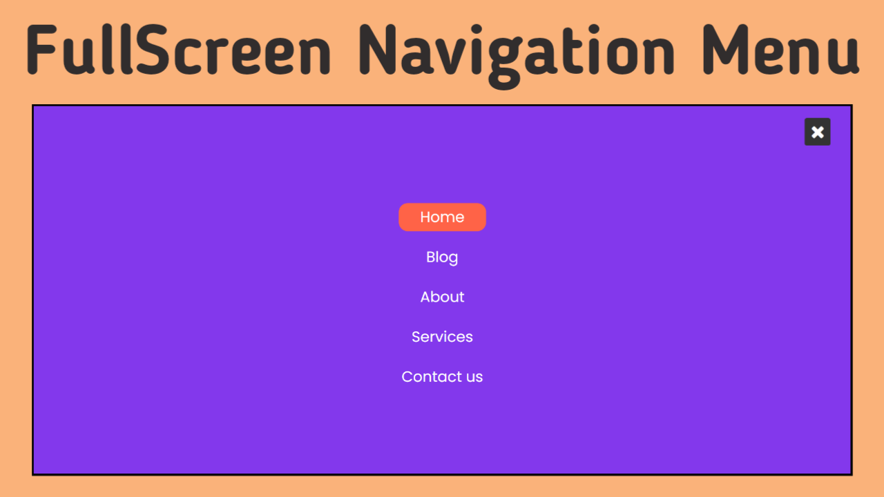
Now, create a div with the class name ‘container’. It holds two more divs, one with the class name ‘toggle’, which contains the Font Awesome bars icon, and the other with the class name ‘menu’, which includes the Font Awesome times icon and an unordered list for the nav links.
Copy and paste the following HTML code into the file named index.html:
<!DOCTYPE html>
<html lang="en">
<head>
    <meta charset="UTF-8">
    <meta http-equiv="X-UA-Compatible" content="IE=edge">
    <meta name="viewport" content="width=device-width, initial-scale=1.0">
    <link rel="stylesheet" href="style.css">
    <!-- Font Awesome Link -->
    <link rel="stylesheet" href="https://cdnjs.cloudflare.com/ajax/libs/font-awesome/4.7.0/css/font-awesome.min.css">
    <title>Full Screen Navigation Menu - Coding Power</title>
</head>
<body>

    <div class="container">
        <div class="toggle">
            <span class="fa fa-bars" onclick="document.querySelector('.menu').classList.add('active')"></span>
        </div>
        <div class="menu">
            <span class="fa fa-times" onclick="document.querySelector('.menu').classList.remove('active')"></span>
            <ul>
                <li><a href="#">Home</a></li>
                <li><a href="#">Blog</a></li>
                <li><a href="#">About</a></li>
                <li><a href="#">Services</a></li>
                <li><a href="#">Contact us</a></li>
            </ul>
        </div>
    </div>

</body>
</html>
Styling with CSS
Create a new file named style.css and add a style link to the HTML head to link to the CSS file. If you miss that, then CSS will not work for any HTML class or element. Firstly, use the @import rule to import the Google Fonts library for the ‘Poppins’ font with different weights.
With the relative positioning, style the container div to take up the entire width and height of the viewport. The toggle span is styled to have absolute positioning, with a font size of 30 pixels, a line height of 35 pixels, a background of #333, and a border radius of 4 pixels.
Now, the menu div is styled to have an absolute positioning with a background of #8338ec, width and height of 100%, z index of 5, top of 0, left of -100%, and a transition of 0.5 seconds to set left as 0 when the active class is applied.
Then, style the menu span to have an absolute positioning with a font size of 30 pixels, a line height of 35 pixels, a background of #333, a border radius of 4 pixels, and a pointer cursor. Also, style the unordered list with an absolute positioning and no list style.
The list items have a block display with center-aligned text, a border radius of 15 pixels, appropriate margin and padding for extra spacing, and a transition of 0.2 seconds to change the background to tomato on hover. The a tag has a font size of 25 pixels with no text decor.
Copy and paste the following CSS code into the file named style.css:
@import url('https://fonts.googleapis.com/css2?family=Poppins:wght@300;400;500;600&display=swap');

*{
    margin: 0;
    padding: 0;
    box-sizing: border-box;
    font-family: 'Poppins', sans-serif;
}

.container{
    position: relative;
    width: 100%;
    height: 100vh;
}

.container .toggle span{
    position: absolute;
    top: 20px;
    left: 35px;
    font-size: 30px;
    line-height: 35px;
    padding: 6px 10px;
    color: white;
    background: #333;
    border-radius: 4px;
    cursor: pointer;
}

.container .menu{
    width: 100%;
    height: 100%;
    background: #8338ec;
    position: absolute;
    top: 0;
    left: -100%;
    z-index: 5;
    transition: 0.5s;
}

.container .menu.active{
    left: 0;
}

.container .menu span{
    position: absolute;
    top: 20px;
    right: 35px;
    font-size: 30px;
    line-height: 35px;
    padding: 6px 10px;
    color: white;
    background: #333;
    border-radius: 4px;
    cursor: pointer;
}

.container .menu ul{
    position: absolute;
    left: 50%;
    top: 50%;
    transform: translate(-50%,-50%);
    list-style: none;
}

.container .menu ul li{
    display: block;
    padding: 5px;
    margin-top: 20px;
    text-align: center;
    border-radius: 15px;
    transition: 0.2s;
}

.container .menu ul li:hover{
    background: tomato;
}

.container .menu ul li a{
    text-decoration: none;
    font-size: 25px;
    color: white;
}
To create the best fullscreen overlay navigation menu using HTML, CSS, and JavaScript, you only need to follow the instructions in the video tutorial or the above steps. Click the button below to access the complete source code.
Conclusion
Now that we have learned how to create the best responsive fullscreen overlay navigation menu using HTML, CSS, and JavaScript, if you still have any doubts, please leave your questions in the comment section. I will be happy to clarify them as soon as possible.
I would like to see what you come up with when you apply this design to your website, along with some additional nav links and styling.
Must Visit: Amazing 3D Card Flip Hover Effect Using HTML and CSS
FAQ
What is overlay in HTML?
Overlay means to cover the surface of something with a coating. In other words, it is used to set one thing on top of another.
The CSS overlay can be triggered by elements when we hover over them, or we could also make separate buttons to activate the overlay.
How do you add navigation in HTML?
The HTML <nav> tag defines navigation sections in web documents. In other words, it represents a set of navigation links we will use to navigate between the pages.
How to make a full-screen navbar?
Create a div with a class name container and give the overlay styles as z−index of 5, top of 0, left of 0, and overflow-x of hidden.
Use the onClick method to change the Font Awesome bars icon to the Font Awesome times icon with the help of JavaScript DOM manipulation.
How to add overlay on menu in CSS?
Create a div with the class name ‘container’. It holds two more divs, one with the class name ‘toggle’ and the other with the class name ‘menu,’ which includes an unordered list for the nav links.
The toggle div contains the Font Awesome bars icon. Finally, apply appropriate styling as per your liking to make it responsive and fullscreen.