Do you want to create a good-looking navigation bar? In this article, you will learn how to create a responsive navigation bar using HTML, CSS, and JS with free access to full source code and a proper code explanation.
A navigation bar is used to link to appropriate sections or pages that help readers traverse the website. It is a simple UI component to aid visitors in accessing information. Users should be able to easily navigate through the site to find what products, goods, or services are promised.
If you have basic knowledge of web development concepts, you will be easily able to create a fully responsive navigation bar using HTML, CSS, and JS.
Table of Contents
Introduction
Are you thinking of adding your site for Google AdSense approval? Then the navigation bar plays a major role in the approval of your site. You should not link to content that does not exist or redirect users to irrelevant and/or misleading web pages.
After learning how to create a responsive navigation bar using HTML and CSS, you will be able to easily rank highly in SEO, get your site approved for Google Adsense, and enjoy many more advantages by incorporating this design into your website.
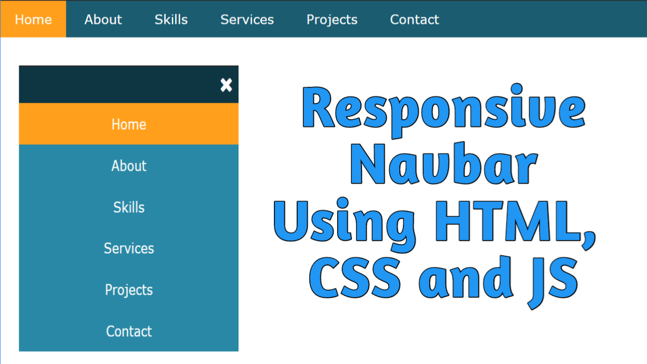
In this article, we will create a responsive navigation bar using HTML, CSS, and JS that will contain basic navlinks with a background color for active links. It is fully responsive with a font awesome bars icon, which converts to a font awesome cross icon when clicked.
Watch the full tutorial on YouTube
Instead of reading this article, you can watch a full tutorial on the Responsive Navigation Bar Using HTML, CSS, and JS on my YouTube channel. Later, you can visit again and access the full source code from here, if required. Do subscribe and like the content if you learn something new.
Source code for the Responsive Navigation Bar using HTML & CSS
Creating the HTML Structure
First, create one file named index.html with a default boilerplate for all the HTML code for the navigation bar. Include the Font Awesome CDN to use icons. Font Awesome is the internet’s icon library and toolkit, used by millions of designers, developers, and content creators.
Create a div with the class name ‘toggle’ and set the onclick property to the menu toggle function. Inside the div, add a font awesome bars icon.
Now, create a div with the class name ‘links’ inside the nav element with the class name ‘navbar’, which holds the unordered list items for navlinks.
Finally, create a script section and use DOM manipulation to select the bars icon and the class name ‘navbar’. Make a menu toggle function to change the font awesome bars icon to the font awesome times icon.
Copy and paste the following HTML code in index.html:
<!DOCTYPE html>
<html lang="en">
<head>
    <meta charset="UTF-8">
    <meta http-equiv="X-UA-Compatible" content="IE=edge">
    <meta name="viewport" content="width=device-width, initial-scale=1.0">
    <link rel="stylesheet" href="style.css">
    <link rel="stylesheet" href="https://cdnjs.cloudflare.com/ajax/libs/font-awesome/4.7.0/css/font-awesome.min.css">
    <title>Responsive Navbar</title>
</head>
<body>
    <div class="toggle" onclick="menutoggle()"><i class="fa fa-bars"></i></div>
    <nav class="navbar">
        <div class="links">
            <ul>
                <li><a href="#">Home</a></li>
                <li><a href="#">About</a></li>
                <li><a href="#">Skills</a></li>
                <li><a href="#">Services</a></li>
                <li><a href="#">Projects</a></li>
                <li><a href="#">Contact</a></li>
            </ul>
        </div>
    </nav>

    <script>
        let icon = document.querySelector(".fa-bars");
        let navbar = document.querySelector(".navbar");

        function menutoggle(){

            if(navbar.classList.contains("active")){
                navbar.classList.remove("active");
                icon.classList.replace("fa-times", "fa-bars");
            }
            else{
                navbar.classList.add("active");
                icon.classList.replace( "fa-bars" ,"fa-times");
            }
        };

    </script>

</body>
</html>
<span style="font-family: arial;"></span>
Styling with CSS
For styling, create a new file named style.css and add a style link to the HTML head to link to the CSS file. If you miss that, then CSS will not work for any HTML class or element, so make sure of that first.
Now, style the toggle div with the width set to 100% and the display set to none. Then, style the i element with the width set to 100%, align the text to the right, padding set to 10 pixels from all sides, font size set to 25 pixels, background set to #1b5c70, and text color set to white.
I then style the nav with the class name ‘navbar’ as a width of 100% and the background as #1b5c70. After that, style the list items as a display of inline-block, appropriate padding for extra spacing, a hover effect to change the background to #ff9f1c, and a pointer cursor.
Make sure to remove the text decoration of all the links in the list items with a font size of 18px and white text color.
Finally, add a media query to change the display of toggle div as a block, background to #2aaad1 and display as none of the nav elements having the class name ‘navbar’, display of list items as block and center align the text, and display of active class as a block.
Copy and paste the following CSS code in style.css:
*{
    margin: 0;
    padding: 0;
    box-sizing: border-box;
    font-family: Verdana, Geneva, Tahoma, sans-serif;
}

.toggle{
    width: 100%;
    display: none;
}

.toggle i{
    width: 100%;
    text-align: right;
    padding: 10px;
    font-size: 25px;
    background:  #1b5c70;
    color: white;
}

.navbar{
    width: 100%;
    background:  #1b5c70;
}

.navbar .links ul li{
    display: inline-block;
    padding: 15px 20px;
}

.navbar .links ul li:hover{
    background: #ff9f1c;
    cursor: pointer;
}

.navbar .links ul li a{
    text-decoration: none;
    font-size: 18px;
    color: white;
}

@media (max-width:768px){
    .toggle{
        display: block;
    }

    .navbar{
        background: #2aaad1;
        display: none;
    }

    .navbar .links ul li{
        display: block;
        text-align: center;
    }

    .active{
        display: block;
    }
}
That’s all you have to do to create a responsive navigation bar using HTML, CSS, and JS. You can access the full source code with images, which is shown in the video tutorial, by clicking the below button.
Conclusion
Now that we have learned about the responsive navigation bar using HTML, CSS, and JS, if you still have any doubts regarding it, feel free to leave your questions in the comment section. I will be happy to clarify them as soon as possible.
I encourage you to learn more about responsive web design and create your own customized and unique designs, like in the Responsive Services Section Using HTML & CSS. I would love to see your creations.
See Also: Awesome Input Animation using HTML & CSS | HTML Input Animations
FAQ
How do I add a navigation bar in HTML?
Create a nav tag, and inside it, create a div with unordered list items for creating the navlinks. Add appropriate styling to the elements for good visual appeal. responsive navigation bar using HTML
How do I make an active navigation bar in HTML?
First, create a nav tag, and inside it, create a div with unordered list items for creating the navlinks. Then add appropriate styling to the elements for good visual appeal.
Finally, use DOM manipulation for selecting the bars icon and the nav element, and change the font awesome bars icon to the font awesome times icon.
How do I make my navigation bar responsive in HTML?
To make a responsive navigation bar using HTML, after creating unordered list items inside a div of a nav element, use a media query.
The media query is used to change the display of toggle div as block, background to #2aaad1 and display as none of the nav element having the class name ‘navbar’, display of list items as block and center align the text, and display of active class as block.