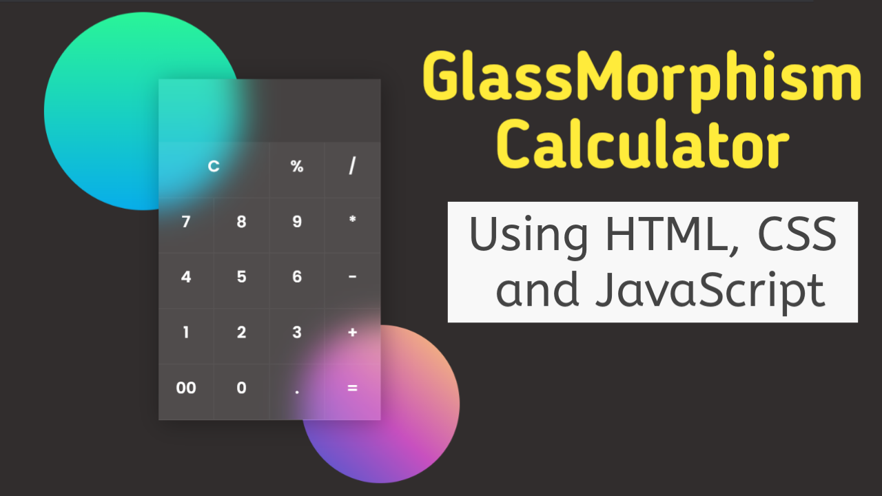
Creating a calculator can be a good starting point for learning the basics of HTML, CSS & JavaScript. We will make a calculator using HTML, CSS & JavaScript but with a unique and perfect glass morphism effect.
The Glass Morphism Effect is a frosted glass effect in which backgrounds are blurred behind semi-transparent panels. It emphasizes the content while maintaining a sense of depth, increasing the user experience and engagement.
Table of Contents
Introduction
Adding different animations and effects can help improve your projects as it increases the user interface and user experience. It is essential to highlight the central part of the project to give a sense of importance.
Creating a calculator using HTML is a very common project, so we will learn how to make it unique by adding a glass morphism effect. So, without further delay, let us create a calculator using HTML.
Watch the full tutorial on YouTube
Sometimes, watching a video tutorial rather than reading an article can help you understand the concept easily. If you prefer that, I have created a video on a Calculator Using HTML, CSS & JavaScript with the Glass Morphism Effect on my YouTube channel. You can access the complete source code here if needed. While you are at it, do subscribe and like the content.
Source code for the Calculator Using HTML, CSS & JavaScript with Perfect Glass Morphism Effect
Creating the HTML Structure
Start by creating an index.html file with the default HTML boilerplate code for the calculator.
Now, create a div with the class name ‘content’ inside the div with the class name ‘container’. Inside the content div, create an input field of type as text with the class name ‘result’, an id of ‘result’, and a read-only attribute.
The content div also contains multiple span elements with the class name ‘number’ and an onclick attribute to display different numbers and signs.
Finally, add a display function inside the script section that accepts a value parameter and uses DOM manipulation to append the value to the result field. The script section also has a result function that evaluates the calculation in the result text field.
Refer to the following HTML code and paste it into the file named index.html:
<!DOCTYPE html>
<html lang="en">
<head>
    <meta charset="UTF-8">
    <meta http-equiv="X-UA-Compatible" content="IE=edge">
    <meta name="viewport" content="width=device-width, initial-scale=1.0">
    <link rel="stylesheet" href="style.css">
    <title>Calculator in GlassMorphism - Coding Power</title>
</head>
<body>

   <div class="container">
       <div class="content">
           <input type="text" class="result" id="result" readonly>
           <span class="number clear" onclick="document.getElementById('result').value = "">C</span>
           <span class="number" onclick="display('%')">%</span>
           <span class="number" onclick="display('/')">/</span>
           <span class="number" onclick="display('7')">7</span>
           <span class="number" onclick="display('8')">8</span>
           <span class="number" onclick="display('9')">9</span>
           <span class="number" onclick="display('*')">*</span>
           <span class="number" onclick="display('4')">4</span>
           <span class="number" onclick="display('5')">5</span>
           <span class="number" onclick="display('6')">6</span>
           <span class="number" onclick="display('-')">-</span>
           <span class="number" onclick="display('1')">1</span>
           <span class="number" onclick="display('2')">2</span>
           <span class="number" onclick="display('3')">3</span>
           <span class="number" onclick="display('+')">+</span>
           <span class="number" onclick="display('00')">00</span>
           <span class="number" onclick="display('0')">0</span>
           <span class="number" onclick="display('.')">.</span>
           <span class="number" onclick="result()">=</span>
       </div>
   </div>

   <script>

       function display(value){
           document.getElementById("result").value += value;
       }

       function result(){
           let displayvalue = document.getElementById("result").value;
           let result = eval(displayvalue);
           document.getElementById("result").value = result;
       }
   </script>

</body>
</html>
Styling with CSS
Create a file named style.css and then link this stylesheet to HTML code. This is a crucial step; otherwise, the styles won’t be applied. Use the @import rule to import the ‘Poppins’ font from the Google Fonts API.
Style the body element to take up the full height of the viewport with a flex display, centered align-items, centered justify-content, and a background of rgb (49, 45, 45).
Now, style the container div to have a relative positioning. Using the before pseudo-class, style the container to have an absolute position, a border radius of 50%, a background color of #08AEEA, a z-index of -1, and apply a linear gradient.
Also, use the after pseudo-class to style the container with an absolute position, a border radius of 50%, a background color of #4158D0, a z-index of -1, and apply a linear gradient.
The content div is styled to have a grid display, a rgba background of (255, 255, 255, 0.1), a box shadow, four grid columns with a separation of 1 fr, and a backdrop filter of blur.
Then, the result field is styled to have no outline and border, a font size of 20 pixels, right text alignment, a transparent background, a pixel solid border-bottom and border-right of rgba color (255, 255, 255, 0.05).
The number span element is styled to have a line height of 70 pixels, a pixel solid border-bottom and border-right of rbga color (255, 255, 255, 0.05), centered text alignment, a font size of 20 pixels, and a transition of 0.2 seconds to change the background on hover.
Copy and paste the following CSS code into the file named style.css:
@import url('https://fonts.googleapis.com/css2?family=Poppins:wght@300;400;500;600&display=swap');

*{
    margin: 0;
    padding: 0;
    box-sizing: border-box;
    font-family: 'Poppins', sans-serif;
}

body{
    height: 100vh;
    display: flex;
    align-items: center;
    justify-content: center;
    background: rgb(49, 45, 45);
}

.container{
    position: relative;
    grid-column: span 4;
}

.container::before{
    content: "";
    position: absolute;
    width: 250px;
    height: 250px;
    border-radius: 50%;
    left: -145px;
    top: -85px;
    background-color: #08AEEA;
    background-image: linear-gradient(0deg, #08AEEA 0%, #2AF598 100%);
    z-index: -1;
}

.container::after{
    content: "";
    position: absolute;
    width: 200px;
    height: 200px;
    border-radius: 50%;
    right: -100px;
    bottom: -80px;
    background-color: #4158D0;
    background-image: linear-gradient(43deg, #4158D0 0%, #C850C0 46%, #FFCC70 100%);
    z-index: -1;
}

.container .content{
    background: rgba(255, 255, 255, 0.1);
    display: grid;
    grid-template-columns: 1fr 1fr 1fr 1fr;
    box-shadow: 3px 3px 30px rgba(0, 0, 0, 0.3);
    backdrop-filter: blur(20px);
}

.container .content .result{
    grid-column: span 4;
    outline: none;
    border: none;
    height: 80px;
    font-size: 20px;
    padding-right: 15px;
    text-align: right;
    background: transparent;
    color: white;
    border-bottom: 1px solid rgba(255, 255, 255, 0.05);
    border-right: 1px solid rgba(255, 255, 255, 0.05);
}

.container .content .number{
    width: 70px;
    height: 70px;
    line-height: 70px;
    border-bottom: 1px solid rgba(255, 255, 255, 0.05);
    border-right: 1px solid rgba(255, 255, 255, 0.05);
    text-align: center;
    color: white;
    font-size: 20px;
    transition: 0.2s;
}

.container .content .number:hover{
background: #d8e42e ;
color: black;
}

.container .content .clear{
    grid-column: span 2;
    width: 140px;
}
After following the above steps, you can easily create a fantastic calculator using HTML, CSS & JavaScript with a perfect glass morphism effect. The video tutorial’s complete source code with images can be accessed by clicking the button below.
Conclusion
We have successfully created a fantastic calculator using HTML, CSS & JavaScript with a unique glass morphism effect by following simple steps. Now, it’s your turn to experiment and build your calculator with additional features.
Are you still having doubts about it, or are you stuck anywhere? No worries; feel free to leave your questions in the comment section, and I will answer them as soon as possible.
See Also: Best Fullscreen Overlay Navigation Menu Using HTML, CSS & JavaScript
FAQ
Can you make a calculator using HTML?
Create a div with the class name ‘content’ inside the div with the class name ‘container’. Inside the content div, create an input field of type as text with the class name ‘result’, an id of ‘result’, and a read-only attribute.
The content div also contains multiple span elements with the class name ‘number’ and an onclick attribute to display different numbers and signs.
How to do calculations in HTML?
Create the basic structure of the calculator using HTML and apply appropriate styling. Finally, add two functions to the script section.
There is a display function inside the script section that accepts a value parameter and uses DOM manipulation to append the value to the result field. The script section also has a result function that evaluates the calculation in the result text field.
How to make a calculator in HTML without JavaScript?
To make a calculator using HTML without JavaScript, use the onclick attribute and the eval function to add the numbers and operators to the result text field and evaluate them.