Want to display a lot of content but are restricted due to the availability of space? Create this amazing 3D card flip hover effect using HTML and CSS. It is a way to add visual interactivity when you want to reveal additional information.
Card designs contain images and text that serve as entry points to more detailed information and organize related information effectively, often linking to other internal pages.
Table of Contents
Introduction
The flip card effect is when a card reveals its backside when clicked or hovered over. It is a way to add visual interactivity when you want to reveal additional information. It is beneficial to add visual components or effects to websites to increase user interactivity and user retention.
Better user experience increases the ranking in search engines. Now, we will learn how to create a unique and fantastic 3D card flip hover effect using HTML and CSS. You can also learn how to create the best product card design using HTML, CSS, and jQuery and try to incorporate this flip effect.
Watch the full tutorial on YouTube
Instead of reading this article, you can watch a full tutorial on the 3D Card Flip Hover Effect Using HTML and CSS on my YouTube channel. If needed, you can access the complete source code from here. Don’t forget to subscribe and like the content if you learned something new.
Source code for the 3D Card Flip Hover Effect Using HTML and CSS
Creating the HTML Structure
Make a file named index.html with the default boilerplate code for all the HTML code for the 3D card flip hover effect. Include the Font Awesome CDN to use custom icons. Font Awesome is the internet’s icon library and toolkit, used by millions of designers, developers, and content creators.
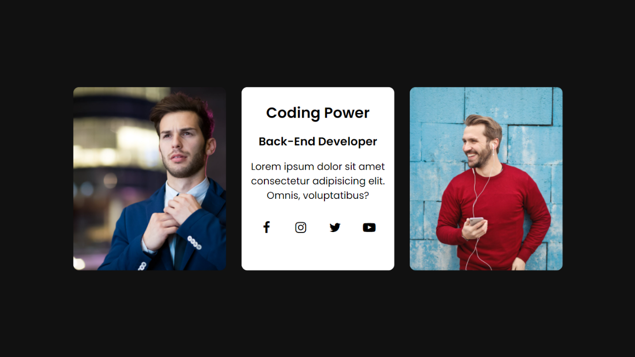
Create multiple divs with the class name ‘card’ to store the card’s details. The card div contains two divs, one with the class name ‘content front’ and the other with the class name ‘content back’.
The front content is simply an image, whereas the back content contains heading tags, a paragraph tag, and a div with the class name ‘social’ to display font awesome icons related to social networking sites.
Copy and paste the following HTML code into a file named index.html:
<!DOCTYPE html>
<html lang="en">
<head>
    <meta charset="UTF-8">
    <meta http-equiv="X-UA-Compatible" content="IE=edge">
    <meta name="viewport" content="width=device-width, initial-scale=1.0">
    <link rel="stylesheet" href="style.css">
    <!-- Font Awesome Link -->
    <link rel="stylesheet" href="https://cdnjs.cloudflare.com/ajax/libs/font-awesome/4.7.0/css/font-awesome.min.css">
    <title>Card Hover 3D Effect - Coding Power</title>
</head>
<body>

    <div class="container">
        <div class="card">
            <div class="content front">
                <img src="images/profile-1.jpg" alt="">
            </div>
            <div class="content back">
                <h2>Coding Power</h2>
                <h3>Front-End Developer</h3>
                <p>Lorem ipsum dolor sit amet consectetur adipisicing elit. At, eius!</p>
                <div class="social">
                    <a href="#"><i class="fa fa-facebook"></i></a>
                    <a href="#"><i class="fa fa-instagram"></i></a>
                    <a href="#"><i class="fa fa-twitter"></i></a>
                    <a href="#"><i class="fa fa-youtube-play"></i></a>
                </div>
            </div>
        </div>
        <div class="card">
            <div class="content front">
                <img src="images/profile-2.jpg" alt="">
            </div>
            <div class="content back">
                <h2>Coding Power</h2>
                <h3>Back-End Developer</h3>
                <p>Lorem ipsum dolor sit amet consectetur adipisicing elit. At, eius!</p>
                <div class="social">
                    <a href="#"><i class="fa fa-facebook"></i></a>
                    <a href="#"><i class="fa fa-instagram"></i></a>
                    <a href="#"><i class="fa fa-twitter"></i></a>
                    <a href="#"><i class="fa fa-youtube-play"></i></a>
                </div>
            </div>
        </div>
        <div class="card">
            <div class="content front">
                <img src="images/profile-3.jpg" alt="">
            </div>
            <div class="content back">
                <h2>Coding Power</h2>
                <h3>Full Stack Developer</h3>
                <p>Lorem ipsum dolor sit amet consectetur adipisicing elit. At, eius!</p>
                <div class="social">
                    <a href="#"><i class="fa fa-facebook"></i></a>
                    <a href="#"><i class="fa fa-instagram"></i></a>
                    <a href="#"><i class="fa fa-twitter"></i></a>
                    <a href="#"><i class="fa fa-youtube-play"></i></a>
                </div>
            </div>
        </div>
    </div>

</body>
</html>
Styling with CSS
Create a CSS file named style.css and then link it to the HTML file. Do not forget this step; otherwise, the CSS styles won’t be applied. Firstly, use the @import rule to import the Google Fonts library for the ‘Poppins’ font with different weights.
Style the body element to take up the full height of the viewport with relative positioning and background as #111. Now, style the container div to have a relative positioning, flex display, flex-wrap as wrap, centered align-items, and justify-content as space-around.
The card div is styled to have a relative positioning with an appropriate margin for extra spacing. Then, the content div is styled to have an absolute positioning, hidden overflow, and a transition of 0.5 seconds.
The front content div is styled to have a border radius of 10 pixels and the img tag has an object fit of cover.
Also, the back content div is styled to have a flex display with the flex-direction as column, centered align-items, centered justify-content, centered text alignment, and a white background with black-colored text.
Style the social div to have a flex display with centered justify-content. The tag has a border radius of 50% with centered text alignment and a line height of 40 pixels. Also, the i tag has a font size of 21 pixels with black-colored text.
On hover, change the a tag’s background to chocolate and the i tag’s text color to white. Finally, add the flip effect to the card on hover using the transform property and rotateX function.
Copy and paste the following HTML code into a file named style.css:
@import url('https://fonts.googleapis.com/css2?family=Poppins:wght@300;400;500;600&display=swap');

*{
    margin: 0;
    padding: 0;
    box-sizing: border-box;
    font-family: 'Poppins', sans-serif;
}

body{
    height: 100vh;
    position: relative;
    background: #111;
}

.container{
    width: 60%;
    position: absolute;
    top: 50%;
    left: 50%;
    transform: translate(-50%,-50%);
    display: flex;
    flex-wrap: wrap;
    align-items: center;
    justify-content: space-around;
}

.container .card{
    width: 250px;
    height: 300px;
    position: relative;
    margin: 10px;
}

.container .card .content{
    position: absolute;
    top: 0;
    left: 0;
    height: 100%;
    width: 100%;
    overflow: hidden;
    transition: 0.5s;
}

.container .card .content.front{
    margin-bottom: 30px;
    border-radius: 10px;
    transform-origin: bottom;
}

.container .card .content.front img{
    height: 100%;
    width: 100%;
    object-fit: cover;
}

.container .card:hover .content.front{
    transform: translateY(-100%) rotateX(90deg);
}

.container .card .content.back{
    display: flex;
    flex-direction: column;
    align-items: center;
    justify-content: center;
    text-align: center;
    background: white;
    color: black;
    transform: translateY(100%) rotateX(90deg);
}

.container .card .content.back h3{
    margin: 15px 0;
}

.container .card .content.back p{
    text-align: center;
}

.container .card .content.back .social{
    margin: 15px 0;
    width: 100%;
    display: flex;
    justify-content: center;
}

.container .card .content.back .social a{
    margin: 8px;
    width: 40px;
    height: 40px;
    border-radius: 50%;
    line-height: 40px;
    text-align: center;
}

.container .card .content.back .social a i{
    font-size: 21px;
    color: black;
}

.container .card .content.back .social a:hover{
    background: chocolate;
}

.container .card .content.back .social a:hover i{
    color: white;
}

.container .card:hover .content.back{
    transform: translateY(0) rotateX(0deg);
}

@media (max-width:425px){
    .container{
        width: 90%;
    }
}
If you follow the above steps carefully, you can create a unique and fantastic 3D card flip hover effect using HTML and CSS. You will get access to the complete source code shown in the video by clicking on the button below.
Conclusion
This article taught us about the amazing 3D card flip hover effect using HTML and CSS. If you are still stuck somewhere or have any doubts regarding the same, feel free to leave your question in the comment section. I will be happy to help.
After this, you will be able to create amazing-looking hover cards. You can even incorporate new effects and animations into your website, which will increase user experience and retention.
Do Visit: Beautiful Delivery App Landing Page Using HTML and CSS
FAQ
What is the flip card effect?
The flip card effect is when a card reveals its backside when clicked or hovered over. It is a way to add visual interactivity when you want to reveal additional information.
How do you add a flip effect in CSS?
To add the flip effect in CSS, use the transform property and rotateX function. It is beneficial to add visual components or effects to websites to increase user interactivity and user retention.
How to make a hover card in CSS?
To make a hovercard in CSS, use the hover CSS pseudo-class. It matches when the user interacts with an element with a pointing device but does not necessarily activate it.
How to make a card flip on hover?
Create multiple divs with the class name ‘card’ to store the card’s details. The card div contains two divs, one with the class name ‘content front’ and the other with the class name ‘content back’.
Finally, add the flip effect to the card on hover using the transform property and rotateX function.