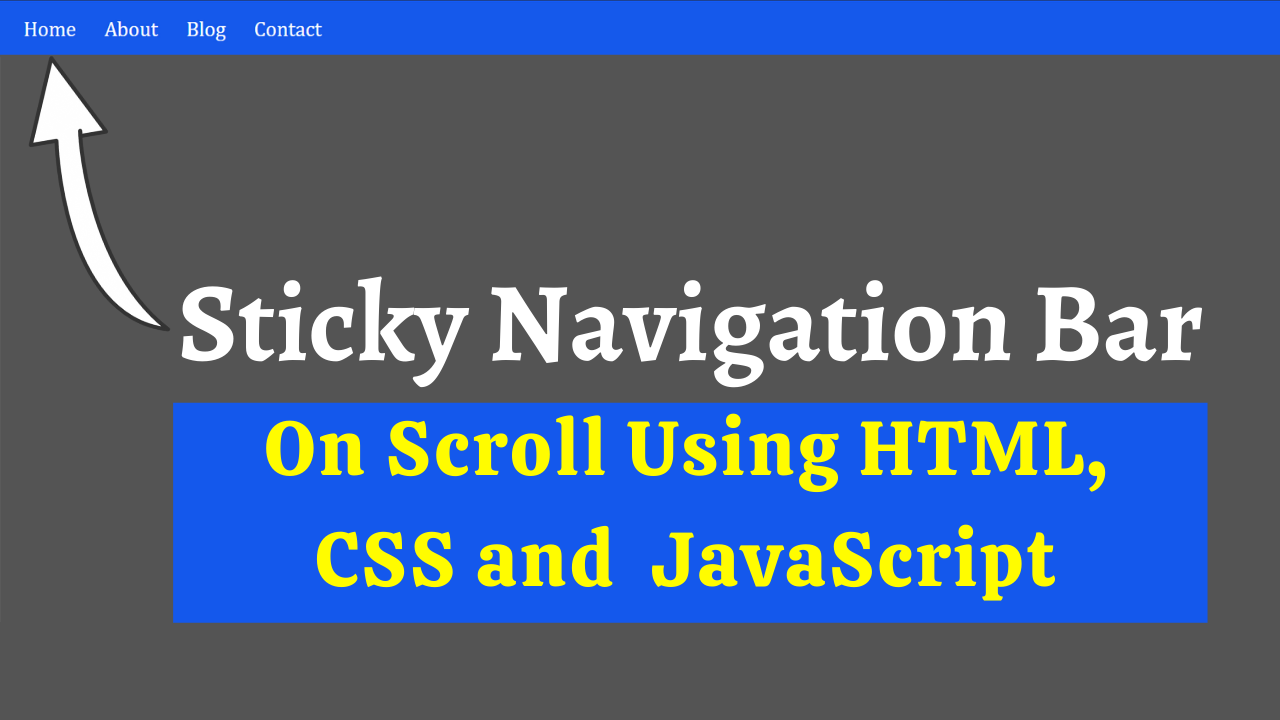
Do you want to create an easily accessible navigation bar? In this article, we will create the best sticky navigation bar using HTML, CSS, and JavaScript.
A sticky menu is a fixed navigation menu on a webpage that remains visible and in the same position as the user scrolls down. The navbar will stick to the top when you reach its scroll position.
Table of Contents
Introduction
The navigation bar is one of the most essential elements on each page. It guides users to different pages easily and increases user experience. It plays a significant role in SEO rankings and AdSense site approvals.
Let us start creating an awesome, good-looking sticky navigation bar using HTML, CSS, and JavaScript. You can even try out new navigation bar designs and incorporate them into your website.
Watch the full tutorial on YouTube
Do you prefer watching a tutorial video over reading an article? No worries. Watch a full tutorial on Sticky Navigation Bar Using HTML, CSS, and JavaScript on my YouTube channel. Later, you can visit again and access the complete source code from here if required. Do subscribe and like the content if you learn something new.
Source code for the Sticky Navigation Bar Using HTML, CSS, and JavaScript
Creating the HTML Structure
The first step is to create a file named index.html with the default HTML boilerplate code for the sticky navigation bar.
Create a div with the class name ‘home’ that holds the nav element with the class name and id ‘navbar’ and the div with the class name ‘content’ that holds multiple paragraph tags. The nav element consists of an unordered list with the class name ‘links’ that includes the nav links.
Finally, create a script section and create two variables: one with the name navbar to get the element by id of ‘navbar’ using DOM manipulation and another with the name sticky to get the offsetTop value of navbar.
The script section also includes a function that gets executed when scrolling the window to add the class name ‘sticky’ when scrollY is greater than the sticky value; otherwise, it removes the class name ‘sticky’ from the navbar.
Copy and paste the following HTML code into the file named index.html:
<!DOCTYPE html>
<html lang="en">
<head>
    <meta charset="UTF-8">
    <meta http-equiv="X-UA-Compatible" content="IE=edge">
    <meta name="viewport" content="width=device-width, initial-scale=1.0">
    <link rel="stylesheet" href="style.css">
    <title>Sticky Navbar | Coding Power</title>
</head>
<body>

   <div class="home">
       <h1>Coding Power</h1>
       <nav class="navbar" id="navbar">
           <ul class="links">
               <li><a href="#">Home</a></li>
               <li><a href="#">Blog</a></li>
               <li><a href="#">About</a></li>
               <li><a href="#">Contact</a></li>
           </ul>
       </nav>
       <div class="content">
           <p>Lorem ipsum dolor sit amet consectetur adipisicing elit. Distinctio voluptas eaque corporis ad ipsa error. Soluta aperiam reprehenderit quo tempore. Corrupti blanditiis veniam expedita nobis, assumenda eaque ea sint beatae repudiandae sed nulla, in dolorem? Temporibus veniam quam saepe illo, sed voluptatem cum id, aliquam doloremque incidunt, expedita dolore consequatur nesciunt consectetur dolorem nobis minima explicabo! Facilis harum dolore quos neque labore, tempore sunt nesciunt maiores eius incidunt dignissimos quam in, dolorem perspiciatis debitis iste. Ducimus ratione modi, cupiditate voluptate enim esse ab blanditiis inventore fugiat corrupti adipisci fugit illum dolorum, mollitia quia earum! In dignissimos culpa illo animi, iure, a deleniti assumenda officiis autem facere totam veniam cum nihil ex id laborum nam. Incidunt fugit veniam qui itaque repudiandae consectetur velit facere illum reiciendis consequatur perspiciatis enim corrupti quaerat quae sint, architecto sed repellat ea, eius dolorem dolorum quisquam, minus maxime voluptate! Molestias, perspiciatis voluptatem asperiores eaque aliquid accusamus?</p>
           <p>Lorem ipsum dolor sit amet consectetur adipisicing elit. Distinctio voluptas eaque corporis ad ipsa error. Soluta aperiam reprehenderit quo tempore. Corrupti blanditiis veniam expedita nobis, assumenda eaque ea sint beatae repudiandae sed nulla, in dolorem? Temporibus veniam quam saepe illo, sed voluptatem cum id, aliquam doloremque incidunt, expedita dolore consequatur nesciunt consectetur dolorem nobis minima explicabo! Facilis harum dolore quos neque labore, tempore sunt nesciunt maiores eius incidunt dignissimos quam in, dolorem perspiciatis debitis iste. Ducimus ratione modi, cupiditate voluptate enim esse ab blanditiis inventore fugiat corrupti adipisci fugit illum dolorum, mollitia quia earum! In dignissimos culpa illo animi, iure, a deleniti assumenda officiis autem facere totam veniam cum nihil ex id laborum nam. Incidunt fugit veniam qui itaque repudiandae consectetur velit facere illum reiciendis consequatur perspiciatis enim corrupti quaerat quae sint, architecto sed repellat ea, eius dolorem dolorum quisquam, minus maxime voluptate! Molestias, perspiciatis voluptatem asperiores eaque aliquid accusamus?</p>
           <p>Lorem ipsum dolor sit amet consectetur adipisicing elit. Distinctio voluptas eaque corporis ad ipsa error. Soluta aperiam reprehenderit quo tempore. Corrupti blanditiis veniam expedita nobis, assumenda eaque ea sint beatae repudiandae sed nulla, in dolorem? Temporibus veniam quam saepe illo, sed voluptatem cum id, aliquam doloremque incidunt, expedita dolore consequatur nesciunt consectetur dolorem nobis minima explicabo! Facilis harum dolore quos neque labore, tempore sunt nesciunt maiores eius incidunt dignissimos quam in, dolorem perspiciatis debitis iste. Ducimus ratione modi, cupiditate voluptate enim esse ab blanditiis inventore fugiat corrupti adipisci fugit illum dolorum, mollitia quia earum! In dignissimos culpa illo animi, iure, a deleniti assumenda officiis autem facere totam veniam cum nihil ex id laborum nam. Incidunt fugit veniam qui itaque repudiandae consectetur velit facere illum reiciendis consequatur perspiciatis enim corrupti quaerat quae sint, architecto sed repellat ea, eius dolorem dolorum quisquam, minus maxime voluptate! Molestias, perspiciatis voluptatem asperiores eaque aliquid accusamus?</p>
           <p>Lorem ipsum dolor sit amet consectetur adipisicing elit. Distinctio voluptas eaque corporis ad ipsa error. Soluta aperiam reprehenderit quo tempore. Corrupti blanditiis veniam expedita nobis, assumenda eaque ea sint beatae repudiandae sed nulla, in dolorem? Temporibus veniam quam saepe illo, sed voluptatem cum id, aliquam doloremque incidunt, expedita dolore consequatur nesciunt consectetur dolorem nobis minima explicabo! Facilis harum dolore quos neque labore, tempore sunt nesciunt maiores eius incidunt dignissimos quam in, dolorem perspiciatis debitis iste. Ducimus ratione modi, cupiditate voluptate enim esse ab blanditiis inventore fugiat corrupti adipisci fugit illum dolorum, mollitia quia earum! In dignissimos culpa illo animi, iure, a deleniti assumenda officiis autem facere totam veniam cum nihil ex id laborum nam. Incidunt fugit veniam qui itaque repudiandae consectetur velit facere illum reiciendis consequatur perspiciatis enim corrupti quaerat quae sint, architecto sed repellat ea, eius dolorem dolorum quisquam, minus maxime voluptate! Molestias, perspiciatis voluptatem asperiores eaque aliquid accusamus?</p>
           <p>Lorem ipsum dolor sit amet consectetur adipisicing elit. Distinctio voluptas eaque corporis ad ipsa error. Soluta aperiam reprehenderit quo tempore. Corrupti blanditiis veniam expedita nobis, assumenda eaque ea sint beatae repudiandae sed nulla, in dolorem? Temporibus veniam quam saepe illo, sed voluptatem cum id, aliquam doloremque incidunt, expedita dolore consequatur nesciunt consectetur dolorem nobis minima explicabo! Facilis harum dolore quos neque labore, tempore sunt nesciunt maiores eius incidunt dignissimos quam in, dolorem perspiciatis debitis iste. Ducimus ratione modi, cupiditate voluptate enim esse ab blanditiis inventore fugiat corrupti adipisci fugit illum dolorum, mollitia quia earum! In dignissimos culpa illo animi, iure, a deleniti assumenda officiis autem facere totam veniam cum nihil ex id laborum nam. Incidunt fugit veniam qui itaque repudiandae consectetur velit facere illum reiciendis consequatur perspiciatis enim corrupti quaerat quae sint, architecto sed repellat ea, eius dolorem dolorum quisquam, minus maxime voluptate! Molestias, perspiciatis voluptatem asperiores eaque aliquid accusamus?</p>
           <p>Lorem ipsum dolor sit amet consectetur adipisicing elit. Distinctio voluptas eaque corporis ad ipsa error. Soluta aperiam reprehenderit quo tempore. Corrupti blanditiis veniam expedita nobis, assumenda eaque ea sint beatae repudiandae sed nulla, in dolorem? Temporibus veniam quam saepe illo, sed voluptatem cum id, aliquam doloremque incidunt, expedita dolore consequatur nesciunt consectetur dolorem nobis minima explicabo! Facilis harum dolore quos neque labore, tempore sunt nesciunt maiores eius incidunt dignissimos quam in, dolorem perspiciatis debitis iste. Ducimus ratione modi, cupiditate voluptate enim esse ab blanditiis inventore fugiat corrupti adipisci fugit illum dolorum, mollitia quia earum! In dignissimos culpa illo animi, iure, a deleniti assumenda officiis autem facere totam veniam cum nihil ex id laborum nam. Incidunt fugit veniam qui itaque repudiandae consectetur velit facere illum reiciendis consequatur perspiciatis enim corrupti quaerat quae sint, architecto sed repellat ea, eius dolorem dolorum quisquam, minus maxime voluptate! Molestias, perspiciatis voluptatem asperiores eaque aliquid accusamus?</p>

       </div>
   </div>

   <script>

    var navbar = document.getElementById("navbar");
    var sticky = navbar.offsetTop;

    window.onscroll = function (){

        if (window.scrollY > sticky) {
            navbar.classList.add("sticky");
        }
        else {
            navbar.classList.remove("sticky");
        }
    };

   </script>

</body>
</html>
Styling with CSS
For styling, create a new file named style.css and add a style link to the HTML head to link to the CSS file. Remember to follow this step; otherwise, the CSS will not work for any HTML class or element.
Style the body element to take up the entire width and height of the viewport. The home div is also styled to take up the full width of the viewport. The heading element has a font size of 35 pixels and centered text alignment.
The navbar is styled to take up the entire width of the viewport, be 60 pixels high, have a flex display, centered align-items, and have a background of RGB (21, 89, 235). The unordered list is also styled to have a flex display with a left margin of 10 pixels.
Now, the nav links are styled to have a block display with appropriate padding for extra spacing, and the <a> tag is styled to have white text and a font size of 22 pixels. Finally, the sticky class is styled to have a fixed position with a top of 0 and a width of 100%.
Refer to the following CSS code and paste it into the file named style.css:
*{
    margin: 0;
    padding: 0;
    box-sizing: border-box;
    list-style: none;
    text-decoration: none;
    font-family: Cambria, Cochin, Georgia, Times, 'Times New Roman', serif;
}

body{
    width: 100%;
    height: 100vh;
}

.home{
    width: 100%;
}

.home h1{
    padding: 30px 0;
    text-align: center;
    font-size: 35px;
}

.home .navbar{
    width: 100%;
    height: 60px;
    background: rgb(21, 89, 235);
    display: flex;
    align-items: center;
}

.home .navbar .links{
    display: flex;
    margin-left: 10px;
}

.home .navbar .links li{
    display: block;
    padding: 5px 15px;
}

.home .navbar .links li a{
    font-size: 22px;
    color: white;
}

.home .content{
    width: 1200px;
    margin: 0 auto;
}

.home .content p{
    margin-top: 25px;
    text-align: justify;
    font-size: 18px;
}

.sticky{
    position: fixed;
    top: 0;
    width: 100%;
}

.sticky + .content{
    padding-top: 60px;
}
That’s all you need to do to create the best sticky navigation using HTML, CSS, and JavaScript. The video tutorial’s complete source code with images can be accessed by clicking the button below.
Conclusion
In this article, we saw how to create a fantastic sticky navigation using HTML, CSS, and JavaScript. You can incorporate this into your websites, and I encourage you to build your custom navigation bar using HTML.
If you are still stuck somewhere or have any doubts regarding the same, feel free to leave your question in the comment section, and I will be happy to help as soon as possible.
Do Visit: Responsive Footer Design Using HTML and CSS
FAQ
What is the sticky navbar effect?
A sticky menu is a fixed navigation menu on a webpage that remains visible and in the same position as the user scrolls down. The navbar will stick to the top when you reach its scroll position.
How to create a sticky navbar in JavaScript?
To create a sticky navbar in JavaScript, create a function that gets executed when scrolling the window to add the class name ‘sticky’ when scrollY is greater than the sticky value, which can be acquired by using the offsetTop attribute; otherwise, remove the class name ‘sticky’ from the navbar.
How do I make the sticky navigation bar only in CSS?
To make the sticky navigation bar only in CSS, the sticky class is styled to have a fixed position, a top of 0, and a width of 100%.