Footers are as important as navbars. In this article, we will see how to create a fantastic and responsive footer design using HTML and CSS.
The footer is used when the user wants to fix the elements at the bottom position to separate the logic of the top elements from the bottom elements’s logic. There are two types of footers fixed footers and movable footers.
Table of Contents
Introduction
The purpose of a website footer is to help users by adding information and navigation options at the bottom of web pages. Important details like the company’s contact information are located in footers that should always be readily available to the users.
Now, let us start by creating a responsive footer design using HTML and CSS by following some simple procedures. You can further apply this knowledge to create different responsive footer designs.
Watch the full tutorial on YouTube
If you prefer watching video tutorials over reading articles, you can watch a full tutorial on Responsive Footer Design Using HTML and CSS on my YouTube channel. You can access the full source code here if needed. While you are at it, do subscribe and like the content.
Source code for the Responsive Footer Design Using HTML and CSS
Creating the HTML Structure
Create a file named index.html with the default HTML boilerplate code for the responsive footer design. Include the Font Awesome CDN to use icons. Font Awesome is the internet’s icon library and toolkit, used by millions of designers, developers, and content creators.
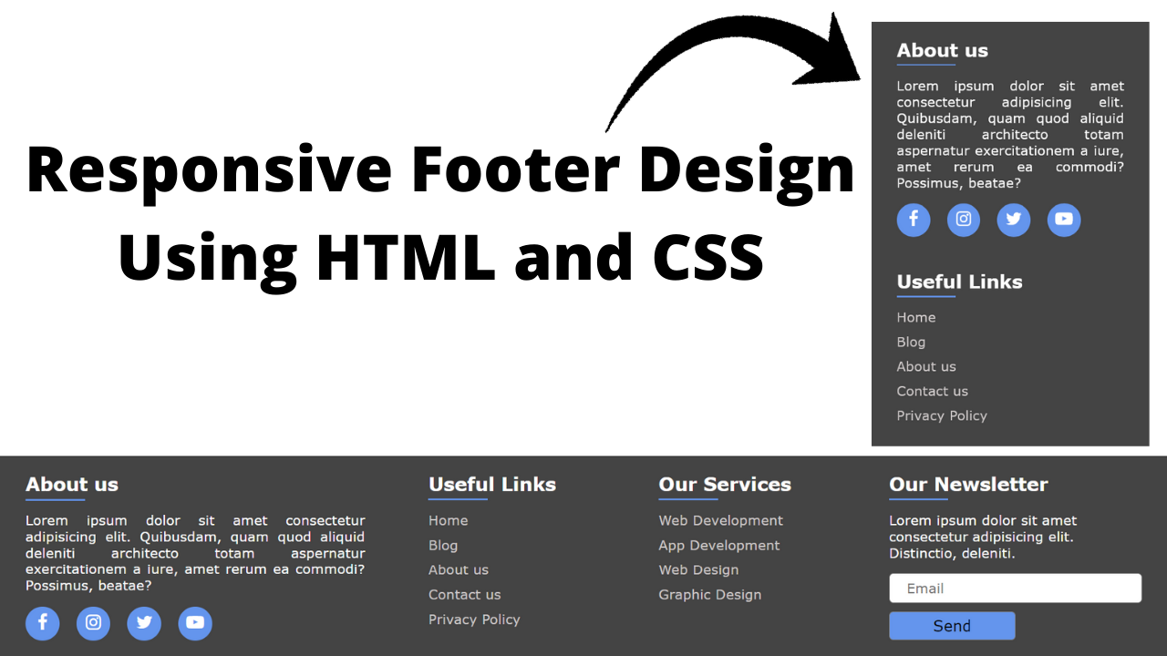
Now, create a div with the class name ‘footer’, which holds a div with the class name ‘about content’, two divs with the class name ‘links content’, and a div with the class name ‘newsletter content’.
The div with the class name ‘about content’ holds a heading and a paragraph, and a div with the class name ‘social’ includes the social links with appropriate Font Awesome icons. Also, each div with the class name ‘links content’ contains a heading and an unordered list of links.
Finally, the div with the class name ‘newsletter content’ includes a heading, a paragraph, and a form that consists of the input field of type as email, a placeholder as Email, and the required attribute and a button of type as submit for form submission handling.
Refer to the following HTML code and paste it into the file named index.html:
<!DOCTYPE html>
<html lang="en">
<head>
    <meta charset="UTF-8">
    <meta http-equiv="X-UA-Compatible" content="IE=edge">
    <meta name="viewport" content="width=device-width, initial-scale=1.0">
    <link rel="stylesheet" href="style.css">
    <link rel="stylesheet" href="https://cdnjs.cloudflare.com/ajax/libs/font-awesome/4.7.0/css/font-awesome.min.css">
    <title>Responsive Footer - Coding Power</title>
</head>
<body>

  <footer>
      <div class="footer">
          <div class="about content">
              <h2>About us</h2>
              <p>Lorem ipsum dolor sit amet consectetur adipisicing elit. Magnam fuga obcaecati illo tempore nam dolorum, nemo porro. Quos expedita similique itaque facilis atque, quia doloremque.</p>
              <div class="social">
                  <a href="#"><i class="fa fa-facebook"></i></a>
                  <a href="#"><i class="fa fa-instagram"></i></a>
                  <a href="#"><i class="fa fa-twitter"></i></a>
                  <a href="#"><i class="fa fa-youtube-play"></i></a>
              </div>
          </div>
          <div class="links content">
              <h2>Useful Links</h2>
              <ul>
                  <li><a href="#">Home</a></li>
                  <li><a href="#">Blog</a></li>
                  <li><a href="#">About us</a></li>
                  <li><a href="#">Contact us</a></li>
                  <li><a href="#">Privacy Policy</a></li>
              </ul>
          </div>
          <div class="links content">
              <h2>Our Services</h2>
              <ul>
                  <li><a href="#">Web Development</a></li>
                  <li><a href="#">App Development</a></li>
                  <li><a href="#">Web Design</a></li>
                  <li><a href="#">Graphic Design</a></li>
              </ul>
          </div>
          <div class="newsletter content">
            <h2>Our Newsletter</h2>
            <p>Lorem ipsum dolor sit amet consectetur adipisicing elit. Hic, aperiam.</p>
            <form action="#">
                <input type="email" placeholder="Email" required>
                <button type="submit">Send</button>
            </form>
          </div>
      </div>
  </footer>

</body>
</html>
Styling with CSS
Create a CSS file named style.css and link it to the HTML file. Do not forget this step; otherwise, the CSS styles won’t be applied.
Style the footer div to have a flex display with a fixed position, a background of #444, white text color, flex-wrap as wrap, and justify-content as spaced-between. The social div is styled to have a flex display with justify-content as a start.
Also, the <a> tag is styled to have a background of cornflower blue, a line height of 40 pixels, centered text alignment, a border radius of 50%, and a transition of 0.2 seconds to change the background as #222 on hover.
The input element is styled to have no outline with a solid border of gray color, a font size of 16 pixels, and a border radius of 5 pixels.
Now, the button element is styled to have a pointer cursor with a solid gray border, a cornflower blue background, and a border radius of 5 pixels. Finally, the media queries are used to make the footer design completely responsive.
Refer to the following CSS code and paste it into the file named style.css:
*{
    margin: 0;
    padding: 0;
    box-sizing: border-box;
    font-family: Verdana, Geneva, Tahoma, sans-serif;
}

.footer{
    width: 100%;
    position: fixed;
    bottom: 0;
    left: 0;
    background: #444;
    color: white;
    padding: 10px;
    display: flex;
    flex-wrap: wrap;
    justify-content: space-between;
}

.footer .content{
    padding: 10px 20px;
}

.footer .content h2{
    font-size: 22px;
    margin-bottom: 20px;
    position: relative;
}

.footer .content h2::after{
    content: "";
    position: absolute;
    bottom: -6px;
    left: 0;
    height: 2px;
    width: 70px;
    background: cornflowerblue;
}

.footer .about{
    flex-basis: 35%;
}

.footer .about p{
    text-align: justify;
}

.footer .about .social{
    width: 100%;
    margin-top: 15px;
    display: flex;
    justify-content: start;
}

.footer .about .social a{
    margin-right: 20px;
    width: 40px;
    height: 40px;
    background: cornflowerblue;
    line-height: 40px;
    text-align: center;
    border-radius: 50%;
    transition: 0.2s;
}

.footer .about .social a:hover{
    background: #222;
}

.footer .about .social a i{
    font-size: 21px;
    color: white;
}

.footer .links{
    flex-basis: 20%;
}

.footer .links ul{
    list-style: none;
}

.footer .links ul li{
    margin-top: 10px;
}

.footer .links ul li a{
    text-decoration: none;
    color: rgb(206, 201, 201);
}

.footer .links ul li a:hover{
    color: rgb(98, 98, 231);
}

.footer .newsletter{
    flex-basis: 25%;
}

.footer .newsletter p{
    text-align: justify;
    margin: 15px 0;
    font-size: 16px;
}

.footer .newsletter input{
    width: 100%;
    height: 35px;
    border: 1px solid gray;
    outline: none;
    padding-left: 20px;
    font-size: 16px;
    border-radius: 5px;
    margin-bottom: 10px;
}

.footer .newsletter button{
    width: 150px;
    padding: 5px;
    font-size: 18px;
    border: 1px solid gray;
    background: cornflowerblue;
    cursor: pointer;
    border-radius: 5px;
}

@media (max-width:950px){
    .footer .content{
        flex-basis: 50%;
        margin-bottom: 20px;
    }
}

@media (max-width:590px){
    .footer .content{
        flex-basis: 100%;
        margin-bottom: 20px;
    }
    .footer .newsletter button{
        width: 100%;
    }
}
By following the above steps carefully, you will be able to create a filterable image gallery using HTML, CSS, and jQuery. The full source code, shown in the video, can be accessed by clicking on the button below.
Conclusion
This article taught us about responsive footer design using HTML and CSS. If you are still stuck or have any doubts, feel free to leave your question in the comment section. I will be happy to help.
After this, you will be able to create unique and responsive footers. You can even incorporate this design and add custom animations to improve the user interface and experience.
See Also: Responsive Team Section Using HTML & CSS
FAQ
How to make a footer responsive in HTML and CSS?
To make a responsive footer design using HTML and CSS, use the media query with max-width of 590px for mobile responsiveness and the media query with max-width of 950px for desktop responsiveness to style the footer content.
What are the different types of footer in CSS?
There are two different types of footers in CSS, one being the fixed footer and another being the movable footer. It is used to fix the elements at the bottom position.