Do you own an agency and want to display your team members? This article will teach us how to create a responsive team section using HTML and CSS.
A team section is very important for an agency to provide information about the team members working with you. The purpose of it is to give potential clients a brief overview of the skill set your team has to offer.
Table of Contents
Introduction
When creating an agency website, creating a team section is an essential step for its success. With increasing access to smartphones, it is very important to have a responsive design.
In this article, you will learn how to design a responsive team section using HTML and CSS by following a simple procedure. You can further apply this knowledge to create different responsive designs.
Watch the full tutorial on YouTube
Sometimes, watching a video tutorial rather than reading an article can help you understand the concept easily. If you prefer that, I have created a video on the Responsive Team Section Using HTML & CSS on my YouTube channel. You can access the complete source code here if needed. While you are at it, do subscribe and like the content.
Source code for the Responsive Team Section Using HTML & CSS
Creating the HTML Structure
The first step is to create a file named index.html with the default HTML code for the responsive team section. In the head section, include the Font Awesome CDN. Font Awesome is a font and icon toolkit based on CSS.
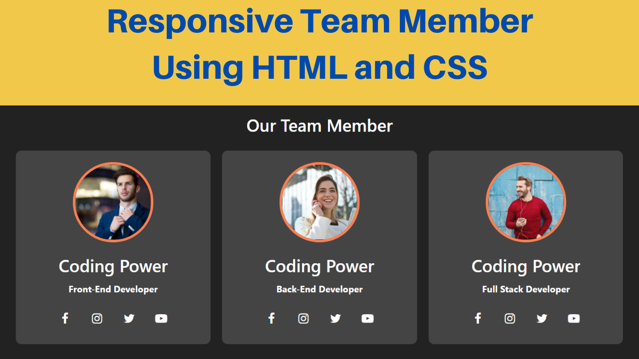
Now, create multiple divs with the class name ‘card’ inside the div with the class name ‘container’. The card div holds a div with the class name ‘content’. Also, the content div holds two divs, one with the class name ‘profile’ and another with the class name ‘detail’.
The profile div holds the img element. Finally, the detail div holds a div with the class name ‘social’, which includes multiple <a> tags for the social site icons from the Font Awesome library.
Copy and paste the following HTML code into the file named index.html:
<!DOCTYPE html>
<html lang="en">
<head>
    <meta charset="UTF-8">
    <meta http-equiv="X-UA-Compatible" content="IE=edge">
    <meta name="viewport" content="width=device-width, initial-scale=1.0">
    <link rel="stylesheet" href="style.css">
    <link rel="stylesheet" href="https://cdnjs.cloudflare.com/ajax/libs/font-awesome/4.7.0/css/font-awesome.min.css">
    <title>Responsive Team Section - Coding Power</title>
</head>
<body>

    <h2>Our Team Members</h2>
    <div class="container">
        <div class="card">
            <div class="content">
                <div class="profile">
                    <img src="images/profile-1.jpg" alt="">
                </div>
                <div class="detail">
                    <h2>Coding Power</h2>
                    <h4>Front-End Developer</h4>
                    <div class="social">
                        <a href="#"><i class="fa fa-facebook"></i></a>
                        <a href="#"><i class="fa fa-instagram"></i></a>
                        <a href="#"><i class="fa fa-twitter"></i></a>
                        <a href="#"><i class="fa fa-youtube-play"></i></a>
                    </div>
                </div>
            </div>
        </div>
        <div class="card">
            <div class="content">
                <div class="profile">
                    <img src="images/profile-2.jpg" alt="">
                </div>
                <div class="detail">
                    <h2>Coding Power</h2>
                    <h4>Back-End Developer</h4>
                    <div class="social">
                        <a href="#"><i class="fa fa-facebook"></i></a>
                        <a href="#"><i class="fa fa-instagram"></i></a>
                        <a href="#"><i class="fa fa-twitter"></i></a>
                        <a href="#"><i class="fa fa-youtube-play"></i></a>
                    </div>
                </div>
            </div>
        </div>
        <div class="card">
            <div class="content">
                <div class="profile">
                    <img src="images/profile-3.jpg" alt="">
                </div>
                <div class="detail">
                    <h2>Coding Power</h2>
                    <h4>Full Stack Developer</h4>
                    <div class="social">
                        <a href="#"><i class="fa fa-facebook"></i></a>
                        <a href="#"><i class="fa fa-instagram"></i></a>
                        <a href="#"><i class="fa fa-twitter"></i></a>
                        <a href="#"><i class="fa fa-youtube-play"></i></a>
                    </div>
                </div>
            </div>
        </div>
    </div>

</body>
</html>
Styling with CSS
For styling, create a new file named style.css and add a style link to the HTML head to link to the CSS file. If you miss that, then styles will not work for any HTML class or element.
Style the body element to take up the entire width and height of the viewport with a flex display, a flex-direction of the column, centered align-items, centered justify-content, a background of #222, and white text color.
The heading element is styled to have a font size of 30 pixels and a font weight of 600. Also, the container div is styled to have a flex display, flex-wrap as wrap, centered align-items, centered justify-content, and centered text alignment.
Now, the card div is styled to have a background of #444, a border radius of 10 pixels, and a transition of 0.3 seconds to change the background to coral on hover. The content div is styled to have a transition of 0.3 seconds to scale the content by a factor of 1.069 on hover.
I then style the profile div with a border radius of 50%, a hidden overflow, a solid coral-colored border of 5 pixels, and an appropriate margin for spacing. Also, the img tag is styled to have a width and height of 100% with object-fit as cover.
The social div is styled to have a flex display with centered justify-content. Finally, a border radius of 50%, a line height of 40 pixels, a centered text alignment, and a transition of 0.2 seconds to change the background to #222 are applied to the <a> tag.
Copy and paste the following CSS code into the file named style.css:
*{
    margin: 0;
    padding: 0;
    box-sizing: border-box;
    font-family:'Segoe UI', Tahoma, Geneva, Verdana, sans-serif ;
}

body{
    width: 100%;
    height: 100vh;
    display: flex;
    flex-direction: column;
    align-items: center;
    justify-content: center;
    background: #222;
    color: white;
}

h2{
    font-size: 30px;
    margin: 15px;
    font-weight: 600;
}

.container{
    display: flex;
    flex-wrap: wrap;
    align-items: center;
    justify-content: center;
    text-align: center;
}

.container .card{
    width: 340px;
    margin: 10px;
    background: #444;
    border-radius: 10px;
    transition: 0.3s;
}

.container .card:hover{
    background: coral;
}

.container .card .content{
    transition: 0.3s;
}

.container .card .content:hover{
    transform: scale(1.069);
}

.container .card .profile{
    width: 140px;
    height: 140px;
    border-radius: 50%;
    overflow: hidden;
    margin: 20px auto;
    border: 5px solid coral;
}

.container .card .profile img{
    width: 100%;
    height: 100%;
    object-fit: cover;
}

.container .card .detail h2,
.container .card .detail h4{
    margin: 10px 0;
}

.container .card .social{
    margin: 15px 0;
    width: 100%;
    display: flex;
    justify-content: center;
}

.container .card .detail .social a{
    margin: 8px;
    width: 40px;
    height: 40px;
    border-radius: 50%;
    line-height: 40px;
    text-align: center;
    transition: 0.2s;
}

.container .card .social a:hover{
    background: #222;
}

.container .card .social a i{
    font-size: 21px;
    color: white;
}
After following the above steps, you can create a responsive team section using HTML. You can access the complete source code with images in the video tutorial by clicking the button below.
Conclusion
Now that we have learned how to create a fantastic and responsive team section using HTML, please leave your questions in the comment section if you still have any doubts. I will be happy to clarify them as soon as possible.
I encourage you to incorporate this design into your website with other effects like card flip on hover and other unique features.
Must See: Best Glass Morphism Login Form Using HTML and CSS
FAQ
How do I create sections in HTML and CSS?
To add a section to a document, use the <div> tag. Large sections of HTML elements can be grouped and formatted with CSS using the div tag.
How to design meet the team page using HTML and CSS?
Create multiple card divs inside the container div. The card div holds a content div. Also, the content div holds the profile div and the detail div. Finally, apply appropriate styling.