Hello everyone! Welcome to Coding Power! In this article, we will create a Responsive Services Section Using HTML & CSS.
Responsive Web Design means designing websites to adjust to devices with different screen sizes. This kind of design aims to retain the appearance of the website regardless of the device it is displayed on.
A services section is very important for an agency or personal portfolio to provide information about the services offered. The purpose of it is to give potential clients a brief overview of the service and sell it effectively.
After following this article, you will learn the basic concept of responsiveness by creating a services section, which will improve the overall user experience, increase user retention, and help rank in search engines.
Table of Contents
Introduction
When creating a portfolio or agency website, creating a services section is an essential step for the success of that website. With increasing access to smartphones, it is very important to have a responsive design. Search engines like Google prioritize mobile-friendly websites in their rankings.
In this article, you will learn how to design a responsive services section using HTML & CSS by following a simple procedure. You can further apply this knowledge to create different responsive designs.
Watch the full tutorial on YouTube
Instead of reading this article, you can watch a full tutorial on the Responsive Services Section Using HTML & CSS on my YouTube channel. You can come back and access the full source code from here if needed. Don’t forget to subscribe and like the content if you learned something new.
Source code for the Responsive Services Section using HTML & CSS
Creating the HTML Structure
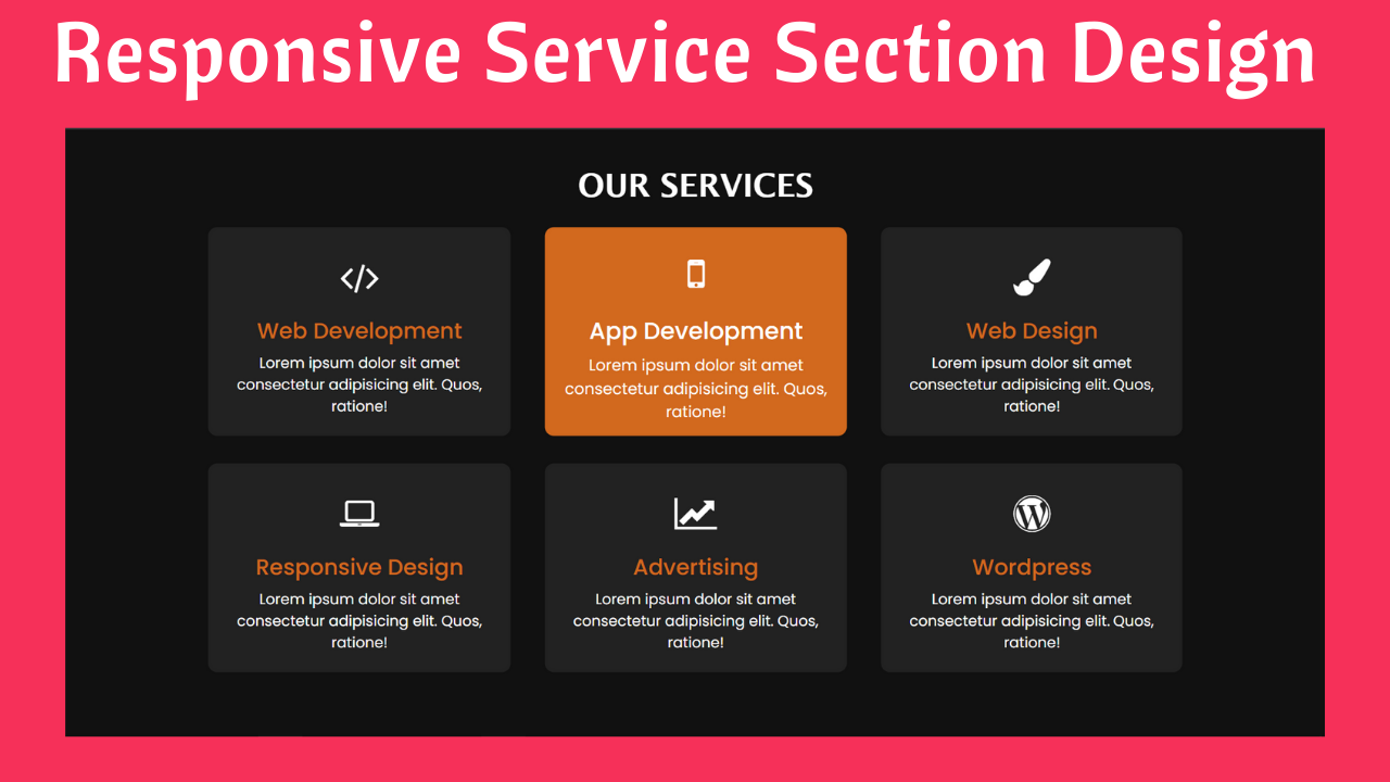
Create an HTML file named index.html with the default boilerplate code for the services section. Include the Font Awesome CDN to use icons. Font Awesome is the internet’s icon library and toolkit, used by millions of designers, developers, and content creators.
Now, create a div with the class name ‘container’, and inside it, create one section with the class name ‘services’.
Then, create multiple divs with the class name ‘card’, which includes a div with the class name ‘content’. Inside the content div, add two divs, one with the class name ‘icon’, the other with the class name ‘title’, and finally a p tag.
The icon div contains a font awesome icon using the i tag; the title div contains the name of the service; and the p tag contains the description of the service.
Given below is the code for index.html:
<!DOCTYPE html>
<html lang="en">
<head>
    <meta charset="UTF-8">
    <meta http-equiv="X-UA-Compatible" content="IE=edge">
    <meta name="viewport" content="width=device-width, initial-scale=1.0">
    <link rel="stylesheet" href="style.css">
    <link rel="stylesheet" href="https://cdnjs.cloudflare.com/ajax/libs/font-awesome/4.7.0/css/font-awesome.min.css">
    <title>Our Services</title>
</head>
<body>
    <div class="container">
        <h2>Our Services</h2>
        <section class="services">
            <div class="card">
                <div class="content">
                    <div class="icon"><i class="fa fa-code"></i></div>
                    <div class="title">Web Development</div>
                    <p>Lorem ipsum dolor sit amet consectetur adipisicing elit. Rerum, reprehenderit.</p>
                </div>
            </div>
            <div class="card">
                <div class="content">
                    <div class="icon"><i class="fa fa-mobile"></i></div>
                    <div class="title">App Development</div>
                    <p>Lorem ipsum dolor sit amet consectetur adipisicing elit. Rerum, reprehenderit.</p>
                </div>
            </div>
            <div class="card">
                <div class="content">
                    <div class="icon"><i class="fa fa-paint-brush"></i></div>
                    <div class="title">Web Design </div>
                    <p>Lorem ipsum dolor sit amet consectetur adipisicing elit. Rerum, reprehenderit.</p>
                </div>
            </div>
            <div class="card">
                <div class="content">
                    <div class="icon"><i class="fa fa-laptop"></i></div>
                    <div class="title">Responsive Design </div>
                    <p>Lorem ipsum dolor sit amet consectetur adipisicing elit. Rerum, reprehenderit.</p>
                </div>
            </div>
            <div class="card">
                <div class="content">
                    <div class="icon"><i class="fa fa-line-chart"></i></div>
                    <div class="title">Advertising </div>
                    <p>Lorem ipsum dolor sit amet consectetur adipisicing elit. Rerum, reprehenderit.</p>
                </div>
            </div>
            <div class="card">
                <div class="content">
                    <div class="icon"><i class="fa fa-wordpress"></i></div>
                    <div class="title">Wordpress</div>
                    <p>Lorem ipsum dolor sit amet consectetur adipisicing elit. Rerum, reprehenderit.</p>
                </div>
            </div>
        </section>
    </div>
</body>
</html>
<span style="font-family: arial;"></span>
Styling with CSS
Create a CSS file named style.css and then link it to the HTML file. Do not forget this step; otherwise, the CSS styles won’t be applied.
Firstly, use the @import rule to import the Google Fonts library for the ‘Poppins’ font with different weights.
Style the body element to occupy the full height of the viewport and set the position as relative. Make the background #111 and the color white.
After that, start with styling the container div with a width of 80% of the viewport, a position of absolute, centered on the screen, and a transform as translate of -50%. Style the h2 with a font size of 35px, align the text in the center, and make it uppercase.
Now, we start with styling the services div as a display of flex, justifying the content of space-around, aligning items to the center, and wrapping the flexbox to make it responsive.
I then styled the card div with a width of 330px, a background of #222, centered on the screen, a border radius of 10px, and appropriate margin and padding for extra space.
The class name ‘title’ is styled with a font size of 24px, a font weight of 500, and a color of chocolate, which has a hover transition of 0.3 seconds to change color to white.
Finally, style the card div with a hover effect that changes the color of the card and a transition of 0.3 seconds to scale the content of the card with a factor of 1.07.
Refer to the following CSS code, and paste it in the style.css file:
@import url('https://fonts.googleapis.com/css2?family=Poppins:ital,wght@0,400;0,500;1,300&display=swap');

*{
    margin: 0;
    padding: 0;
    box-sizing: border-box;
    font-family: 'Poppins', sans-serif;
}

body{
    height: 100vh;
    position: relative;
    background: #111;
    color: white;
}

.container{
    width: 80%;
    position: absolute;
    top: 50%;
    left: 50%;
    transform: translate(-50%,-50%);
}

.container h2{
    text-align: center;
    text-transform: uppercase;
    font-size: 35px;
    margin-bottom: 25px;
    font-family: 'Lucida Sans', 'Lucida Sans Regular', 'Lucida Grande', 'Lucida Sans Unicode', Geneva, Verdana, sans-serif;
}

.container .services{
    justify-content: space-around;
    display: flex;
    flex-wrap: wrap;
    align-items: center;
}

.container .services .card{
    width: 330px;
    text-align: center;
    background: #222;
    padding: 20px 15px;
    margin-bottom: 30px;
    border-radius: 10px;
    cursor: pointer;
    transition: 0.3s;
}

.container .services .card:hover{
    background: chocolate;
}

.container .services .card .content{
    transition: 0.3s;
}

.container .services .card:hover .content{
    transform: scale(1.07);
}

.container .services .card .content .icon{
    padding: 5px 0;
    color: white;
}

.container .services .card .content .icon i{
    font-size: 40px;
}

.container .services .card:hover .content .title{
    color: white;
}

.container .services .card .content .title{
    padding: 5px 0;
    font-size: 24px;
    font-weight: 500;
    color: chocolate;
    transition: 0.3s;
}
By following the above steps, you will be able to create a responsive services section using HTML & CSS. You can get access to the full source code, which is shown in the video, by clicking on the button below.
Conclusion
Now that we have learned about the responsive services section using HTML & CSS, if you still have any doubts regarding it, feel free to leave your questions in the comment section. I will be happy to clarify them as soon as possible.
I encourage you to learn more about responsive web design and create your own customized and unique service section. I would love to see your creations.
Must Visit: Best Product Card Design Using HTML, CSS, and jQuery
FAQ
How to create responsive services section using HTML and CSS?
Utilize Flexbox to arrange the service cards horizontally and ensure they adjust their layout based on screen size. The flex-wrap property can be used to wrap the cards as the size of the screen changes.
How to make website responsive with CSS and HTML?
Using CSS media queries, you can make a website responsive. It allows you to apply CSS styles depending on the device’s screen. Follow the principle of Always Design for Mobile First. You should avoid using fixed-width text blocks. Use percentages or units such as ‘rem’, ’em’, or ‘fr’ instead of ‘px’.
Why is responsive website important?
Responsive design will help you make your site mobile-friendly, improve the way it looks on devices of different sizes, and increase the time users spend on your site. It also helps you improve your ranking in search engines.
How responsive is my website?
To test the responsiveness of your website, use the Responsive Design Mode or Toggle Device Toolbar present in the developer tools of each browser. You can even use sites like Responsinator or Website Responsive Test.
How to write responsive CSS without media query?
You can write responsive CSS without using media queries by using CSS Flexbox or Grid. These layout systems allow you to create flexible layouts that adapt to different screen sizes. You can use CSS Grid with units like ‘fr’ to create flexible grid layouts that resize based on available space.