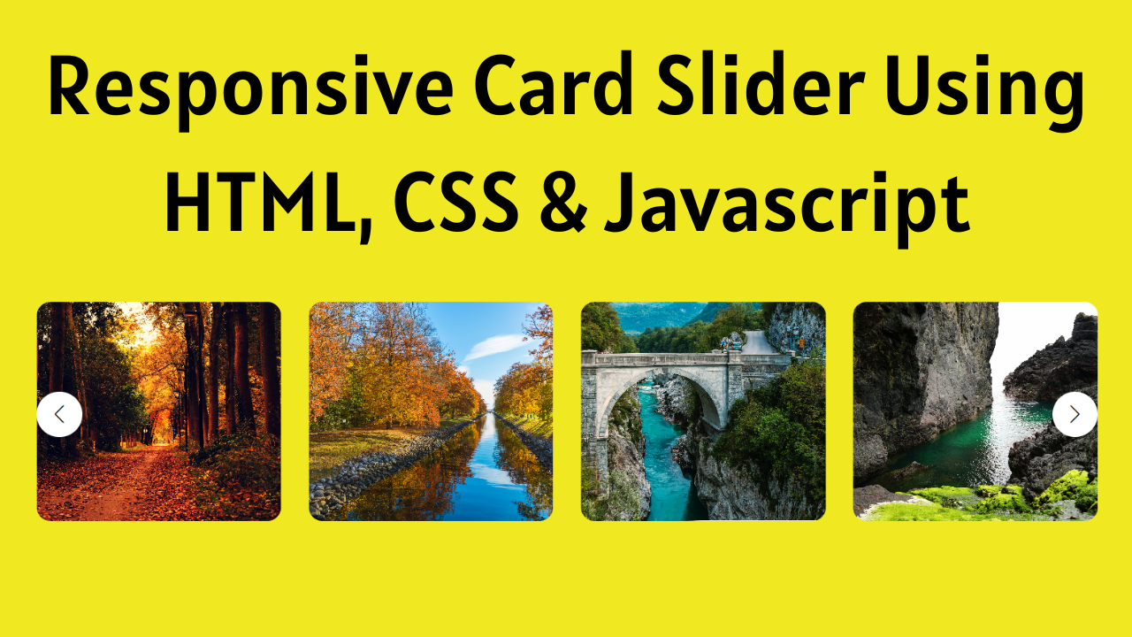
Welcome to Coding Power! If you are looking for a responsive card slider using HTML, CSS and JavaScript, then you don’t have to go anywhere else because in this article you can learn how to do that with a proper code explanation and full source code.
We can use card sliders using HTML to improve the look of our website. You must have seen card sliders on most OTT platform sites like Netflix, Amazon Prime, Disney Plus, Hotstar, and many more. They are using the card slider to show all the movies and show them in a list, so the user can easily scroll and decide on the most interesting content.
Table of Contents
Introduction
In this fast-growing world, engaging website users is becoming crucial every day, but sometimes we can easily achieve that by adding beautiful and responsive sliders. It can be an image slider, poster banners like Amazon Shopping Offers on their home page, or a testimonial slider on any portfolio site for any web developer. These different types of sliders can be useful in different ways for providing informative content and engaging users on the website.
For the card slider, I am going to use the most popular library, SwiperJS. SwiperJs provides multiple functionalities for different kinds of sliders, so you can use them according to your requirements on your website or application. Also, it supports Javascript, React, Vue, and Manu. They provide multiple demos by default, which you can check out on their site and use directly in your code.
Watch the Full Tutorial on YouTube
I have made one video on Responsive Card Slider using HTML, CSS and JavaScript on YouTube. So, if you prefer video over blog posts, then you can watch this full tutorial on my YouTube channel, and then you can come back here if you need the full source code. You can also check out more tutorials on my channel and subscribe if you like my content.
Source code for the Card Slider using HTML, CSS, and JS
Creating the HTML Structure
First, create one file with the name index.html for all the HTML code for the card slider.
So first of all, add a basic HTML template, and then we have to add Swiper CDN links for CSS and JavaSript so we can use Swiper JS features in an HTML webpage. If you want to use SwiperJs with React, then you can directly install the package using the command npm install swiper and import that into your component.
After adding the CDN links, I added a simple container with multiple image items and also made sure not to change the class names like swiper and swiper-slide because without that slider will not function properly.
Then update all the image sources according to your image path in the project. After that, add 2 arrow buttons for sliding left and right, and style that button for the proper with the card and center vertically.
Once the button is working properly, we need to add the breakpoints to the swiper configuration for the different card items and the space between cards in the different sizes of devices, so we added multiple breakpoints for widths of 500, 868, 1000, and 1250 with the configuration. Using this, we can achieve the proper responsive card slider design.
<!DOCTYPE html>
<html lang="en">

<head>
    <meta charset="UTF-8" />
    <meta http-equiv="X-UA-Compatible" content="IE=edge" />
    <meta name="viewport" content="width=device-width, initial-scale=1.0" />
    <link rel="stylesheet" href="./styles.css" />
    <title>Image Slider in HTML, CSS & JavaScript - Coding Power</title>

    <!-- Link Swiper's CSS -->
    <link rel="stylesheet" href="https://cdn.jsdelivr.net/npm/swiper/swiper-bundle.min.css" />
</head>

<body>

    <div class="container">
        <div class="slider mySwiper">
            <div class="image-items swiper-wrapper">
                <div class="image swiper-slide"><img src="./images/image1.jpg" alt=""></div>
                <div class="image swiper-slide"><img src="./images/image2.jpg" alt=""></div>
                <div class="image swiper-slide"><img src="./images/image3.jpg" alt=""></div>
                <div class="image swiper-slide"><img src="./images/image4.jpg" alt=""></div>
                <div class="image swiper-slide"><img src="./images/image5.jpg" alt=""></div>
                <div class="image swiper-slide"><img src="./images/image6.jpg" alt=""></div>
                <div class="image swiper-slide"><img src="./images/image7.jpg" alt=""></div>
                <div class="image swiper-slide"><img src="./images/image8.jpg" alt=""></div>
                <div class="image swiper-slide"><img src="./images/image9.jpg" alt=""></div>
            </div>
            <div class="swiper-button-next arrowButton right"></div>
            <div class="swiper-button-prev arrowButton left"></div>
        </div>
    </div>

    <!-- Swiper JS -->
    <script src="https://cdn.jsdelivr.net/npm/swiper/swiper-bundle.min.js"></script>

    <!-- Initialize Swiper -->
    <script>
        var swiper = new Swiper(".mySwiper", {
            slidesPerGroup: 1,
            loop: true,
            fade: true,
            grabCursor: true,
            loopFillGroupWithBlank: true,
            navigation: {
                nextEl: ".swiper-button-next",
                prevEl: ".swiper-button-prev",
            },
            breakpoints: {
                500: {
                    slidesPerView: 2,
                    spaceBetween: 20,
                },
                868: {
                    slidesPerView: 3,
                    spaceBetween: 30,
                },
                1000: {
                    slidesPerView: 4,
                    spaceBetween: 30,
                },
                1250: {
                    slidesPerView: 5,
                    spaceBetween: 30,
                },
            },
        });
    </script>

</body>
</html>
Styling with CSS
For Styling Create a new file with the name styles.css and add a style link to the HTML head to link to the CSS file. If you miss that, then CSS will not work for any HTML class or element, so make sure of that first.
Once this is done, then we will start with styling for the slider container, so first we will center the whole container horizontally and vertically using the display flex, justify-content center, and height 100 vh for the body, and add a fixed height of 240 px on the container for the center view.
After that, we have to style the slider for the image items, like giving a width of 100%, and for the img tag object-fit cover, so the image will fit properly according to the different sizes. Once that is done, the next important thing is the arrow button, which is left and right. For that, I have used position absolute for showing on the center at left and right.
Also, I have used the left and right classes, which are added to those buttons just for the left and right sizes. For the left arrow button, the left value should be 0px, and for the right arrow button, the right value should be 0px. Otherwise, all the properties are the same, so for that, I have used the arrowButton class name.
In the end, the card slider is taking up more margin on the small devices, so I used MediaQuery to override the margin for devices that have a lower width than 868px and added a margin of 20px so that the slider can have more width on small devices.
*{
    margin: 0;
    padding: 0;
    box-sizing: border-box;
}

body{
    height: 100vh;
    display: flex;
    justify-content: center;
    align-items: center;
    background-color: #f0e922;
}

.container{
    width: 100%;
    height: 240px;
}

.slider{
    margin: 0 40px;
    height: 100%;
    overflow: hidden;
    position: relative;
}

.slider .image-items{
    height: 100%;
}

.slider .image-items .image{
    height: 100%;
}

.slider .image-items .image img{
    height: 100%;
    display: block;
    width: 100%;
    object-fit: cover;
    border-radius: 15px;
}

.arrowButton{
    position: absolute !important;
    top: 50% !important;
    color: black !important;
    width: 50px !important;
    height: 50px !important;
    border-radius: 50% !important;
    background-color: white !important;
    padding: 10px !important;
}

.arrowButton.left{
    left: 0 !important;
}

.arrowButton.right{
    right: 0 !important;
}

.arrowButton::after{
    font-size: 20px !important;
}

@media only screen and (max-width:868px){
    .slider{
        margin: 0 20px;
    }
}
That’s all you have to do for the responsive card slider using HTML, CSS and JavaScript. Still, if you are facing any kind of issue after using the above code, you can download the full source code with images, which is shown in the video tutorial.
Conclusion
In this blog, we have shown all the steps with a proper explanation of the full code, so it will help you learn and create a card slider using HTML, CSS and JavaScript according to your needs. Still, if you are not getting anything from the above code or if you have any doubts regarding the card slider, feel free to leave your question in the comment section. I am happy to help.
Must Visit: Best Filterable Image Gallery using HTML, CSS, and jQuery
FAQ
How to make a slider using JS ?
In Javascript, you can use a library like SwiperJs to make the responsive image slider and card slider easily because SwiperJs provides multiple features like a multi-row slider, image lazy loading, and more.
How do I add a slider in React JS?
If you want to add a slider in React JS, then you can also use SwiperJS. The Swiper package comes with so many demo components, so you can check all that out on the Swiper site and use it according to your needs.
How to make a responsive slider in HTML and CSS?
For the response design, you can use user media queries in the CSS for the different sizes of breakpoints according to your webpage, and if you’re using SwiperJS, then it’s really easy to add the breakpoints to the swiper configuration.