Do you want to make it easy for your users to contact you? In this article, we will create a responsive Contact Us form using HTML and CSS. A Contact Us form allows users to contact the site owners quickly.
It usually includes fields like Name, Email, Phone Number, Subject, and Message. Contact forms are commonly used for communication between users and site owners for various purposes like feedback, inquiry, collaboration requests, etc.
Table of Contents
Introduction
Contact Us forms make it easy for users to contact the website owners, provide feedback and suggestions, and report issues. They act as a direct medium for users to find help or support and allow users to inquire about services or partnerships.
It is a great accessibility feature that improves user interaction and experience and can help improve SEO. Now, without delay, let us start by creating a responsive Contact Us form using HTML and CSS.
Watch the full tutorial on YouTube
If you prefer watching video tutorials over reading articles, you can watch a full tutorial on Responsive Contact Us Form Using HTML & CSS on my YouTube channel. If needed, you can access the complete source code here. While you are at it, do subscribe and like the content.
Source code for the Responsive Contact Us Form Using HTML & CSS
Creating the HTML Structure
First, create a file named index.html with the default HTML boilerplate code for the responsive Contact Us form.
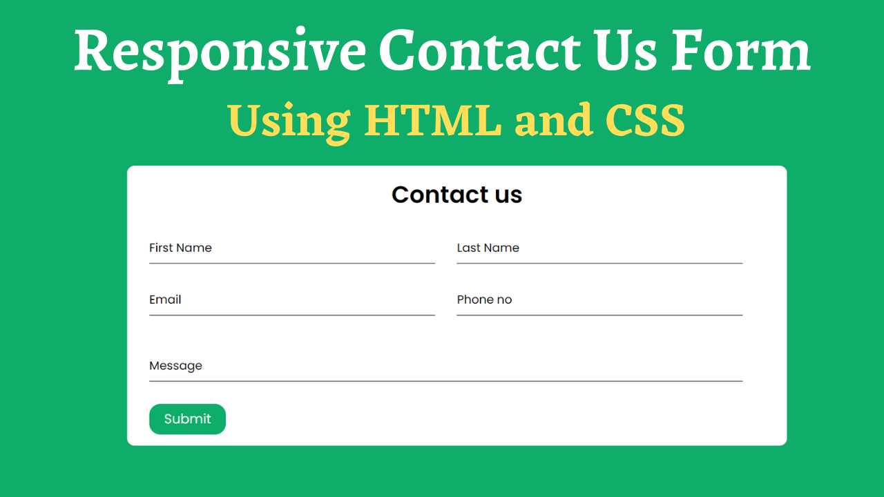
Create a Contact Us heading and a form inside the div with the class name ‘container’. The form contains multiple divs with the class name ‘row’. For each row div, create another div with the class name ‘field’.
Then, create the input text fields with the type of text for the First Name, Last Name, and Message label. Also, create the input text field with the type of email for the Email label and the input text field with the type of number for the Phone Number label.
Finally, an input element with the submit type attribute and the Submit value attribute will be created to handle the form submission logic.
Refer to the following HTML code and paste it into the file named index.html:
<!DOCTYPE html>
<html lang="en">
<head>
    <meta charset="UTF-8">
    <meta http-equiv="X-UA-Compatible" content="IE=edge">
    <meta name="viewport" content="width=device-width, initial-scale=1.0">
    <link rel="stylesheet" href="style.css">
    <title>Responsive Contact us Form - Coding Power</title>
</head>
<body>

    <div class="container">
        <h1>Contact us</h1>
        <form action="#">
            <div class="row">
                <div class="field">
                    <input type="text" required>
                    <label>First Name</label>
                </div>
                <div class="field">
                    <input type="text" required>
                    <label>Last Name</label>
                </div>
            </div>
            <div class="row">
                <div class="field">
                    <input type="email" required>
                    <label>Email</label>
                </div>
                <div class="field">
                    <input type="number" required>
                    <label>Phone no</label>
                </div>
            </div>
            <div class="row">
                <div class="field message">
                    <input type="text" required>
                    <label>Message</label>
                </div>
            </div>
            <input type="submit" value="Submit">
        </form>
    </div>

</body>
</html>
Styling with CSS
Create a CSS file named style.css and link it to the HTML file. Do not forget this step; otherwise, the CSS styles won’t be applied. Firstly, use the @import rule to import the Google Fonts library for the ‘Poppins’ font with different weights.
Style the body element to take up the full height of the viewport with the flex display, centered align-items, centered justify-content, and a background of #0ead69.
The container div is styled to have a border radius of 10 pixels, a white background, a flex display, a flex-direction of the column, a flex-wrap of wrap, and appropriate padding for extra spacing.
Style the heading element to have center text alignment, a font weight of 600, and a margin-bottom of 30 pixels. The row div has a display of flex, and the fields have relative positioning with a width of 100% and an appropriate margin for spacing.
The input element is styled to have a block display with no outline or border, a font size of 16 pixels, and a 2 pixels solid border-bottom of gray color. The label element is also styled to have absolute positioning, a font size of 16 pixels, and a transition of 0.3 seconds.
Then, the submit button is styled to have a border radius of 15 pixels, a background of #0ead69, no outline or border, a pointer cursor, and a font size of 18 pixels. Finally, the media queries will be used to make the Contact Us form responsive.
Copy and paste the following CSS code into the file named style.css:
@import url('https://fonts.googleapis.com/css2?family=Poppins:wght@300;400;500;600&display=swap');

*{
    margin: 0;
    padding: 0;
    box-sizing: border-box;
    font-family: 'Poppins', sans-serif;
}

body{
    height: 100vh;
    display: flex;
    align-items: center;
    justify-content: center;
    background: #0ead69;
}

.container{
    width: 65%;
    background: white;
    border-radius: 10px;
    padding: 15px 30px;
    display: flex;
    flex-direction: column;
    flex-wrap: wrap;
}

.container h1{
    text-align: center;
    font-weight: 600;
    margin-bottom: 30px;
}

.container form .row{
    display: flex;
}

.container form .row .field{
    width: 100%;
    position: relative;
    margin: 0 30px 30px 0;
}

.container form .row .field input{
    display: block;
    width: 100%;
    height: 40px;
    border: none;
    border-bottom: 2px solid gray;
    outline: none;
    font-size: 16px;
}

.container form .row .message input{
    height: 60px;
}

.container form .row .field input:focus{
    border-color:#390099 ;
}

.container form .row .field label{
    position: absolute;
    bottom: 10px;
    left: 0;
    pointer-events: none;
    font-size: 16px;
    transition: 0.3s;
}

.container form .row .field input:focus ~ label,
.container form .row .field input:valid ~ label{
    transform: translateY(-23px);
    color: #390099;
}

.container form input[type=submit]{
    padding: 7px 20px;
    outline: none;
    border-radius: 15px;
    background: #0ead69;
    border: none;
    color: white;
    cursor: pointer;
    font-size: 18px;
}

@media (max-width:1024px){
    .container{
        width: 80%;
    }
}

@media (max-width:768px){
    .container{
        width: 90%;
    }
}

@media (max-width:650px){
    .container{
        width: 95%;
    }
    .container form .row{
        display: block;
    }
}
Following the above steps, you can create an excellent responsive Contact Us form using HTML and CSS. You will get access to the complete source code shown in the video by clicking on the button below.
Conclusion
This article taught us about the responsive Contact Us form using HTML and CSS. If you are still stuck or have any questions, please leave them in the comment section. I will be happy to help.
After this, you will be able to create amazing-looking contact forms. You can even incorporate new designs and different forms into your website, increasing user interaction.
See Also: Calculator Using HTML, CSS & JavaScript with Perfect Glass Morphism Effect
FAQ
How to design a form using HTML and CSS?
To design a form using HTML and CSS, we use the HTML <form> element. It starts with the <form> tag and ends with the </form> tag.
We can add the input elements within the form tags to take user input with form elements, such as email fields, password fields, text fields, textarea, buttons, etc.
What is the input for contact form in CSS?
Create the input text fields with the type of text for the First Name, Last Name, and Message label.
Also, create the input text field with the type of email for the Email label and the input text field with the type of number for the Phone Number label.
How to create a responsive contact us page using HTML and CSS?
To create a responsive Contact Us page using HTML and CSS, create a Contact Us heading and a form inside the div with the class name ‘container’.
The form contains multiple divs with the class name ‘row’. For each row div, create another div with the class name ‘field’. Finally, the media queries will be used to make the Contact Us form responsive.