Do you want to create a replica of the Netflix home page? In this article, we will follow easy steps to create the perfect Netflix home page using HTML and CSS.
Netflix is a subscription-based streaming service that allows visitors to watch TV shows and movies on an internet-connected device. The content shown on Netflix varies by region and may change over time.
Table of Contents
Introduction
With the use of technology, people can watch and listen to broadcasts in real time through video streaming. These broadcasts are exclusive to internet-connected devices and are transmitted via the internet.
In this article, you will learn how to create a perfect Netflix home page using HTML and CSS by following easy-to-follow steps. After this, you will be confident in incorporating this design and enhancing your website.
Watch the full tutorial on YouTube
Do you prefer watching a tutorial video over reading an article? No worries; you can watch a full tutorial on the Netflix Home Page Using HTML and CSS on my YouTube channel. Later, you can visit again and access the complete source code from here, if required. Do subscribe and like the content if you learn something new.
Source code for the Netflix Home Page Using HTML and CSS
Creating the HTML Structure
First, create a file named index.html with the default HTML boilerplate code for the Netflix home page.
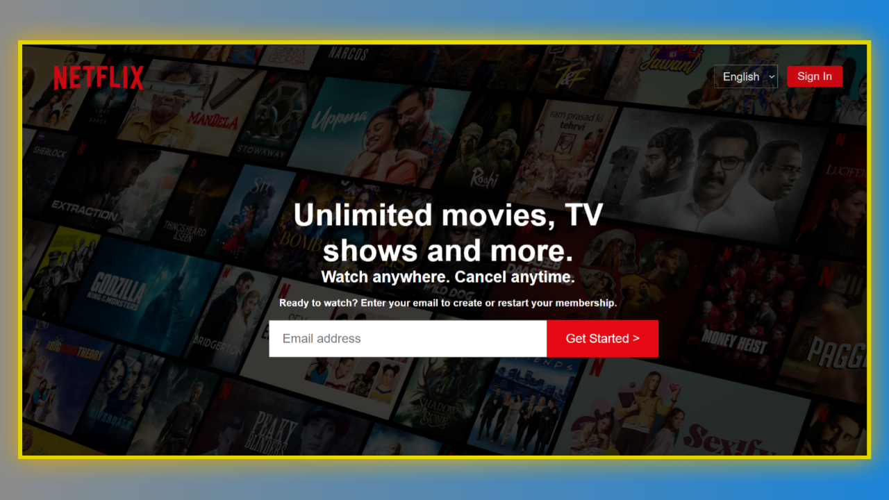
Create a div with the class name ‘container’ that consists of a nav element with the class name ‘navbar’ and a div with the class name ‘title’. The nav element holds two divs, one with the class name ‘left’ and the other with the class name ‘right’.
The left div contains an img element, and the right div consists of a select element with two options for languages: English or Hindi. Now, the title div contains a div with the class name ‘content’. The content div consists of heading tags and a form.
Finally, the form element includes a heading tag and an email input with a call-to-action button to get started.
Refer to the following HTML code and paste it into the file named index.html:
<!DOCTYPE html>
<html lang="en">

<head>
    <meta charset="UTF-8">
    <meta http-equiv="X-UA-Compatible" content="IE=edge">
    <meta name="viewport" content="width=device-width, initial-scale=1.0">
    <link rel="stylesheet" href="style.css">
    <title>Netflix India - Watch TV Shows Online, Watch Movies Online</title>
</head>
<body>

    <div class="container">
        <nav class="navbar">
            <div class="left">
                <img src="images/netflix-logo.png" alt="">
            </div>
            <div class="right">
                <select name="language" class="language">
                    <option value="English">English</option>
                    <option value="Hindi">Hindi</option>
                </select>
                <button><a href="#">Sign In</a></button>
            </div>
        </nav>

        <div class="title">
            <div class="content">
                <h1>Unlimited movies, TV shows and more.</h1>
                <h2>Watch anywhere. Cancel anytime.</h2>
                <form action="#">
                    <h3>Ready to watch? Enter your email to create or restart your membership.</h3>
                    <div class="email">
                        <input type="email" name="email" placeholder="Email address">
                        <button><a href="#">Get Started  ></a></button>
                    </div>
                </form>
            </div>
        </div>
    </div>
</body>
</html>
Styling with CSS
Create a file named style.css and link it to the HTML. This step is essential; otherwise, the styles will not be applied.
Style the body element to take up the entire width and height of the viewport with a black background, white-colored text, and a font family of Helvetica Neue, Helvetica, Arial, and sans-serif.
Using the before pseudo-class, the container div is styled to have an absolute positioning with an image background, an opacity of 0.3, and a z-index of -1. The nav element is styled to have a flex display.
Now, the left div is styled to have a flex display with a float of left, and the img element is styled to have an absolute positioning. Also, the right div is styled to have a flex display with absolute positioning and a right float.
The radio button options with the class name ‘language’ are styled to have a font size of 18 pixels, centered align-items, centered justify-content, a pointer cursor, and white text. The option element is styled to have a grey background.
I then styled the button element to have a font size of 18 pixels, centered align-items, centered justify-content, a font-weight of 400, a background of #e50914, a pointer cursor, a border radius of 4 pixels, and no border or outline.
Finally, the email input is styled to have a font size of 20 pixels with no outline, and the button element is styled to have a font size of 20 pixels with centered align-items, centered justify-content, a background of #e50914, a cursor pointer, and no border or outline.
Copy and paste the following CSS code into the file named style.css:
*{
    padding: 0;
    margin: 0;
    box-sizing: border-box;
}
body{
    width: 100%;
    height: 100%;
    color: white;
    background: black;
    font-family: 'Helvetica Neue',Helvetica,Arial,sans-serif;
}
.container::before{
    content: "";
    background: url(images/netflix-bg.jpg) no-repeat center center/cover;
    position: absolute;
    height: 100%;
    width: 100%;
    opacity: 0.3;
    z-index: -1;
}
.container .navbar{
    height: 100px;
    display: flex;
}
.container .navbar .left{
    height: 100%;
    display: flex;
    float: left;
}
.container .navbar .left img{
    height: 100px;
    position: absolute;
    left: 35px;
}
.container .navbar .right{
    display: flex;
    height: 100px;
    float: right;
    position: absolute;
    right: 50px;
}
.container .navbar .right .language{
    margin: auto;
    align-items: center;
    justify-content: center;
    font-size: 18px;
    padding: 7px 10px;
    color: white;
    background: none;
    cursor: pointer;
    margin-right: 15px;
}
.container .navbar .right .language option{
    background-color: grey;
}
.container .navbar .right button{
    margin: auto;
    align-items: center;
    justify-content: center;
    font-size: 18px;
    font-weight: 400;
    padding: 7px 17px;
    background: #e50914;
    cursor: pointer;
    outline: none;
    border-radius: 4px;
    border: none;
}
.container .navbar .right button a{
    text-decoration: none;
    color: white;
}
.container .title{
    padding: 70px 45px;
}
.container .title .content{
    width: 950px;
    margin: auto;
    padding: 75px 0;
    text-align: center;
}
.container .title .content h1{
    width: 650px;
    margin: auto;
    font-size: 3.1rem;
    text-align: center;
}
.container .title .content h2{
    width: 650px;
    margin: auto;
    font-size: 1.6rem;
    text-align: center;
}
.container .title .content form h3{
    font-size: 1rem;
    margin: 18px 0;
    text-align: center;
}
.container .title .content form .email{
    width: 1000px;
    margin: auto;
}
.container .title .content form .email input{
    height: 60px;
    width: 450px;
    margin: auto;
    padding: 20px;
    font-size: 20px;
    outline: none;
}
.container .title .content form .email button{
    margin: auto;
    height: 60px;
    width: 180px;
    align-items: center;
    justify-content: center;
    font-size: 20px;
    padding: 7px 17px;
    background: #e50914;
    cursor: pointer;
    outline: none;
    border-top-right-radius: 2px;
    border-bottom-right-radius: 2px;
    border: none;
    margin-left: -5px;
}
.container .title .content form .email button:hover{
    background-color: #f40612;
}
.container .title .content form .email button a{
    text-decoration: none;
    color: white;
}
After following the above steps, you can create a perfect Netflix home page using HTML and CSS. You can access the complete source code shown in the tutorial by clicking the following button.
Conclusion
Now that we have learned how to create the Netflix home page using HTML and CSS, please leave your questions in the comment section if you still have any doubts. I will be happy to clarify them as soon as possible.
I encourage you to learn more about this design and create customized and unique designs, like the YouTube Home Page Using HTML and CSS. I would love to see your creations.
See Also: How to Make an Amazing Drop-Down Menu in HTML and CSS
FAQ
How to make a Netflix website using HTML and CSS?
Create a container div that consists of a nav element and a title div. The nav element holds a left div and a right div. Create heading tags, an email input form, and a call-to-action button to get started. Finally, apply appropriate styling.
Does Netflix use HTML5 video?
Yes, Netflix uses HTML5 video for streaming content. The HTML5 video element tells the browser to load a video file from another source by specifying its location.