Want to showcase your photography skills but don’t know how? Then, this perfect responsive image gallery using HTML and CSS will help you display your images in a well-organized and attractive way.
Image Gallery is used to store and display a collection of pictures. It showcases a selection of images with optional captions. In other words, it is an area where all photos for your website are stored.
Table of Contents
Introduction
Images speak to our emotions, imagination, and unconscious. A responsive image gallery will allow your images to be displayed correctly on all devices, from desktop computers to mobile phones.
In this article, you will learn how to create a responsive image gallery using HTML and CSS by following easy-to-follow steps. After this, you will be confident in incorporating this design and enhancing your website.
Watch the full tutorial on YouTube
Do you prefer watching a tutorial video over reading an article? No worries; you can watch a full tutorial on the Responsive Image Gallery Using HTML and CSS on my YouTube channel. Later, you can visit again and access the complete source code from here if required. Do subscribe and like the content if you learn something new.
Source code for the Responsive Image Gallery Using HTML and CSS
Creating the HTML Structure
First, create a file named index.html with the default HTML boilerplate code for the responsive image gallery.
Create a div with the class name ‘gallery’, which contains multiple divs with the class name ‘image’. The image div contains <img> element with the image source for the image gallery.
Copy and paste the following HTML code into the file named index.html:
<!DOCTYPE html>
<html lang="en">
<head>
<meta charset="UTF-8">
<meta http-equiv="X-UA-Compatible" content="IE=edge">
<meta name="viewport" content="width=device-width, initial-scale=1.0">
<link rel="stylesheet" href="style.css">
<title>Gallery</title>
</head>
<body>
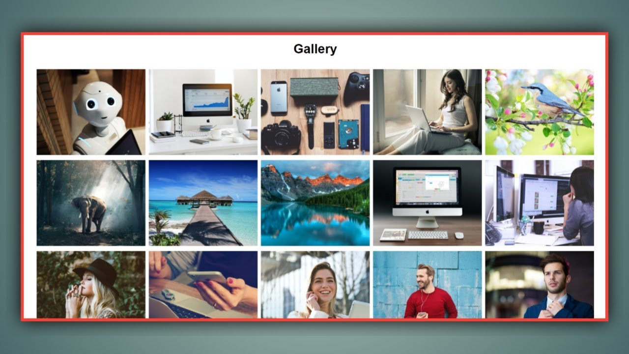
<h2>Gallery</h2>
<div class="gallery">
<div class="image">
<img src="images/1.jpg" alt="">
</div>
<div class="image">
<img src="images/2.jpg" alt="">
</div>
<div class="image">
<img src="images/3.jpg" alt="">
</div>
<div class="image">
<img src="images/4.jpg" alt="">
</div>
<div class="image">
<img src="images/5.jpg" alt="">
</div>
<div class="image">
<img src="images/6.jpg" alt="">
</div>
<div class="image">
<img src="images/7.jpg" alt="">
</div>
<div class="image">
<img src="images/8.jpg" alt="">
</div>
<div class="image">
<img src="images/9.jpg" alt="">
</div>
<div class="image">
<img src="images/10.jpg" alt="">
</div>
<div class="image">
<img src="images/11.jpg" alt="">
</div>
<div class="image">
<img src="images/12.jpg" alt="">
</div>
<div class="image">
<img src="images/13.jpg" alt="">
</div>
<div class="image">
<img src="images/14.jpg" alt="">
</div>
<div class="image">
<img src="images/15.jpg" alt="">
</div>
</div>
</body>
</html>Styling with CSS
Create a file named style.css and link it to the HTML. This step is essential; otherwise, the styles will not be applied. Import the Poppins font from the Google Fonts API.
The heading element is styled to have a center text alignment with a font size of 30 pixels and a margin of 15 pixels. Then, the gallery div is styled to have a grid display with a grid gap of 0.5 rem, a grid-auto-flow of dense, and repeat the grid columns.
The image div is styled to have a minimum height of 150 pixels, and finally, the img element is styled to have an object-fit of cover with a height of 200 pixels and a width of 100%.
Refer to the following CSS code and paste it into the file named style.css:
*{
    margin: 0;
    padding: 0;
    box-sizing: border-box;
    font-family: Arial, Helvetica, sans-serif;
}

h2{
    text-align: center;
    font-size: 30px;
    margin: 15px;
}

.gallery{
    margin: 30px;
    display: grid;
    grid-template-columns: repeat(auto-fit, minmax(250px,1fr));
    grid-gap: 0.5rem;
    grid-auto-flow: dense;
}

.gallery .image{
    min-height: 150px;
}

.gallery .image img{
    width: 100%;
    height: 200px;
    object-fit: cover;
}
After following the above steps, you can create an impressive and responsive image gallery using HTML and CSS. The complete source code shown in the tutorial can be accessed by clicking the following button.
Conclusion
Now that we have learned about the responsive image gallery using HTML and CSS, please leave your questions in the comment section if you still have any doubts. I will be happy to clarify them as soon as possible.
I encourage you to learn more about responsiveness and create customized and unique designs, like the filterable image gallery using HTML, CSS, and jQuery. I would love to see your creations.
See Also: Best Sidebar Menu using HTML, CSS & JavaScript
FAQ
How to create an image gallery using HTML and CSS?
Create a div with the class name ‘gallery’ which contains multiple divs with the class name ‘image’. The image div contains <img> element with the image source for the image gallery. Finally, apply appropriate styling.
What is the collection of images in HTML?
The document’s <img> elements collection can be obtained using HTML’s image collection property. The <img> tag embeds an image in an HTML page.