Want to showcase how well you know a skill but don’t know how? Then, this perfect animated skills bar using HTML and CSS will help you display your knowledge of the skill in a well-organized and attractive way.
A skill bar is a UI component that showcases your skills in percentage to attract HRs who need to filter a large number of candidates from a pile of resumes or potential clients.
Table of Contents
Introduction
You might have seen an animated skills bar using HTML and CSS in many portfolio websites. They are a great way to attract users and showcase skills in a well-organized manner. It helps in improving user retention also.
In this article, you will learn how to create a perfect animated skills bar using HTML and CSS by following easy-to-follow steps. After this, you will be confident in incorporating this design and enhancing your website.
Watch the full tutorial on YouTube
Do you prefer watching a tutorial video over reading an article? No worries; you can watch a full tutorial on the Animated Skills Bar Using HTML and CSS on my YouTube channel. Later, you can visit again and access the complete source code from here if required. Do subscribe and like the content if you learn something new.
Source code for the Animated Skills Bar Using HTML and CSS
Creating the HTML Structure
First, create a file named index.html with the default HTML boilerplate code for the animated skills bar.
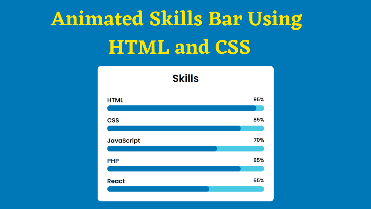
Create multiple divs with the class name ‘skill’ inside a div with the class name ‘container’. Each skill div contains the skill name, a percentage, and two span tags, one with the class name ‘skill-bar’ and the other with the class name ‘fill-bar’ plus the skill name.
Copy and paste the following code into the file named index.html:
<!DOCTYPE html>
<html lang="en">
<head>
    <meta charset="UTF-8">
    <meta http-equiv="X-UA-Compatible" content="IE=edge">
    <meta name="viewport" content="width=device-width, initial-scale=1.0">
    <link rel="stylesheet" href="style.css">
    <title>Animated Skills Bar - Coding Power</title>
</head>
<body>

    <div class="container">
        <h1>Skills</h1>
        <div class="skill">
            <h3>HTML</h3>
            <h4>95%</h4>
            <span class="skill-bar"></span>
            <span class="fill-bar html"></span>
        </div>
        <div class="skill">
            <h3>CSS</h3>
            <h4>85%</h4>
            <span class="skill-bar"></span>
            <span class="fill-bar css"></span>
        </div>
        <div class="skill">
            <h3>JavaScript</h3>
            <h4>70%</h4>
            <span class="skill-bar"></span>
            <span class="fill-bar javascript"></span>
        </div>
        <div class="skill">
            <h3>PHP</h3>
            <h4>85%</h4>
            <span class="skill-bar"></span>
            <span class="fill-bar php"></span>
        </div>
        <div class="skill">
            <h3>React</h3>
            <h4>65%</h4>
            <span class="skill-bar"></span>
            <span class="fill-bar react"></span>
        </div>
    </div>

</body>
</html>
Styling with CSS
Create a file named style.css and link it to the HTML. This step is essential; otherwise, the styles will not be applied. Import the Poppins font from the Google Fonts API.
Style the body element to take up the full height of the viewport, display as flex, centered align-items, centered justify-content, and background of #0077b6. Then, style the container div with a white background and a border radius of 10 pixels.
Style the h1 element with center text alignment and a font-weight of 600. Also, style the skill div with 100% width, centered aligned items, and relative positioning. The h3 element is styled to display inline-block, and the h4 element is styled to have float as right.
I then style the skill-bar span to have absolute positioning, a border radius of 15 pixels, and a background of #48cae4. Now, the fill-bar span is styled to have absolute positioning, a border radius of 15 pixels, and a background of #0077b6.
Finally, add the animation to the skill bar using keyframes with a duration of 2 seconds. The keyframe sets the width from 0% to the set width percentage for a custom fill animation.
Copy and paste the following code into the file named style.css:
@import url('https://fonts.googleapis.com/css2?family=Poppins:wght@300;400;500;600&display=swap');

*{
    margin: 0;
    padding: 0;
    box-sizing: border-box;
    font-family: 'Poppins', sans-serif;
}

body{
    display: flex;
    align-items: center;
    justify-content: center;
    height: 100vh;
    background: #0077b6;
}

.container{
    width: 550px;
    background: white;
    border-radius: 10px;
    padding: 15px 30px;
}

.container h1{
    text-align: center;
    font-weight: 600;
    margin-bottom: 30px;
}

.container .skill{
    margin-bottom: 30px;
    width: 100%;
    align-items: center;
    position: relative;
}

.container .skill h3{
    display: inline-block;
    margin-bottom: 5px;
}

.container .skill h4{
    float: right;
}

.container .skill .skill-bar{
    position: absolute;
    top: 30px;
    left: 0;
    width: 100%;
    height: 17px;
    border-radius: 15px;
    background: #48cae4;
}

.container .skill .fill-bar{
    position: absolute;
    top: 30px;
    left: 0;
    height: 17px;
    border-radius: 15px;
    background: #0077b6;
}

.container .skill .html{
    animation: html 2s;
    width: 95%;
}

.container .skill .css{
    animation: css 2s;
    width: 85%;
}

.container .skill .javascript{
    animation: javascript 2s;
    width: 70%;
}

.container .skill .php{
    animation: php 2s;
    width: 85%;
}

.container .skill .react{
    animation: react 2s;
    width: 65%;
}

@keyframes html{
    from{
        width: 0;
    }
    to{
        width: 95%;
    }
}

@keyframes css{
    from{
        width: 0;
    }
    to{
        width: 85%;
    }
}

@keyframes javascript{
    from{
        width: 0;
    }
    to{
        width: 70%;
    }
}

@keyframes php{
    from{
        width: 0;
    }
    to{
        width: 85%;
    }
}

@keyframes react{
    from{
        width: 0;
    }
    to{
        width: 65%;
    }
}
After following the above steps, you can create a perfect animated skills bar using HTML and CSS. You can access the complete source code shown in the tutorial by clicking the following button.
Conclusion
Now that we have learned about the animated skills bar using HTML and CSS, please leave your questions in the comment section if you still have any doubts. I will be happy to clarify them as soon as possible.
I encourage you to learn more about animations and create customized and unique designs, like in the Typing Animation using Typed.js. I would love to see your creations.
Must Visit: Responsive Personal Portfolio Website Using HTML, CSS, and JavaScript
FAQ
How to make animation using HTML CSS?
You need an HTML element with a class name to make an animation in CSS and HTML.
Then, use the transform property to add a simple motion effect or a group of keyframes that define the styles at the start and end of the animation.
How to add skills bar in HTML CSS?
Create multiple divs with the class name ‘skill’ inside a div with the class name ‘container’.
Each skill div contains the skill name, a percentage, and two span tags, one with the class name ‘skill-bar’ and the other with the class name ‘fill-bar’ plus the skill name.
How to make an animated progress and skill bar using HTML, CSS, JS?
Style the container div and skill div with appropriate styling. Then, add the animation to the skill bar using keyframes for 2 seconds.
The keyframe sets the width from 0% to the set width percentage for a custom fill animation.