Do you want to reflect on your skills and experiences but don’t know how? In this article, learn how to create a personal portfolio website using HTML, CSS, and JavaScript, which is fully responsive.
A portfolio website is a unique platform that allows you to showcase your work and tell others about yourself. In other words, it is a curated online space that highlights your best work and achievements, skills, and experiences.
Table of Contents
Introduction
The essential elements for your portfolio website using HTML include a showcase of your work, your About page, case studies conducted by you, testimonials, an effective call to action, and a blog.
We will learn how to create a portfolio website using HTML, CSS, and JavaScript. You can add an animated skills bar while incorporating this responsive personal portfolio website using HTML.
Watch the full tutorial on YouTube
Sometimes, watching a video tutorial rather than reading an article can help you understand the concept easily. If you prefer that, I have created a video on the Responsive Personal Portfolio Website Using HTML, CSS, and JavaScript on my YouTube channel. You can access the full source code here if needed. While you are at it, do subscribe and like the content.
Source code for the Responsive Personal Portfolio Website Using HTML, CSS, and JavaScript
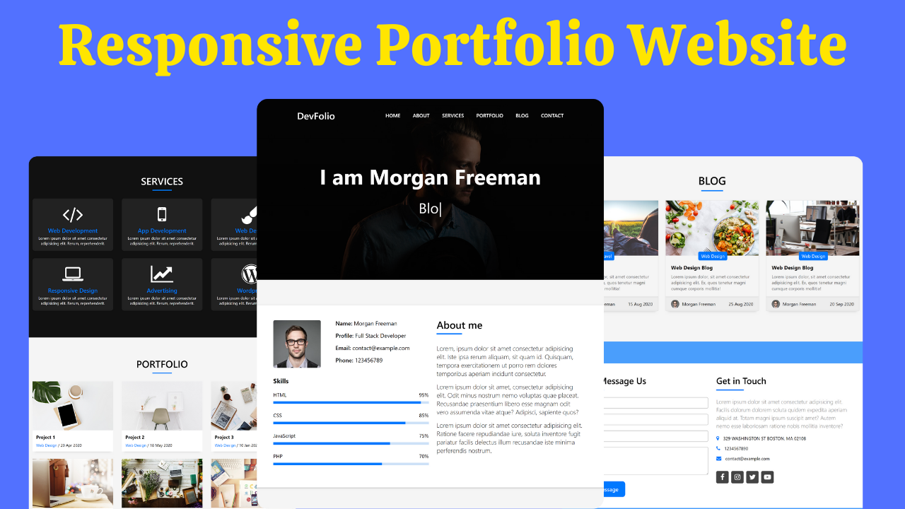
Creating the HTML Structure
Create a file named index.html with the default HTML boilerplate code for the responsive personal portfolio website.
Start by creating a navbar that contains the logo and nav links. Then, make a Home section that uses the typed.js library for a beautiful typing animation. Next, the About section is created, which contains all the personal information about the skills that you acquire.
The Services section includes information about the services offered. Its purpose is to give potential clients a brief overview of the service and sell it effectively. Then, the Portfolio section contains a curated list of projects you have worked on.
Next, create a Blog section that can help you rank on the search engines, and finally, create a Contact section through which visitors can easily get in touch with you.
Refer to the following HTML code and paste it into the file named index.html:
<!DOCTYPE html>
<html lang="en">
<head>
<meta charset="UTF-8">
<meta http-equiv="X-UA-Compatible" content="IE=edge">
<meta name="viewport" content="width=device-width, initial-scale=1.0">
<link rel="stylesheet" href="style.css">
<title>DevFolio Website - Coding Power</title>
<!-- typed.js -->
<script src="https://cdnjs.cloudflare.com/ajax/libs/typed.js/2.0.12/typed.min.js"></script>
<!-- font awesome link -->
<link rel="stylesheet" href="https://cdnjs.cloudflare.com/ajax/libs/font-awesome/4.7.0/css/font-awesome.min.css">
</head>
<body>
<!-- scroll to top button -->
<button class="scrollbtn" id="btn" type="button" onclick="scrolltoTop()"><i class="fa fa-arrow-up"></i></button>
<!-- navbar code start here -->
<nav class="navbar" id="navbar">
<div class="logo">
<a href="#home">DevFolio</a>
</div>
<ul class="menu" id="menu">
<li><a href="#home" onclick="menu()">Home</a></li>
<li><a href="#about" onclick="menu()">About</a></li>
<li><a href="#services" onclick="menu()">Services</a></li>
<li><a href="#portfolio" onclick="menu()">PortFolio</a></li>
<li><a href="#blog" onclick="menu()">Blog</a></li>
<li><a href="#contact" onclick="menu()">Contact</a></li>
</ul>
<div class="menu-btn" onclick="menu()"><i class="fa fa-bars"></i></div>
</nav>
<!-- home section start here -->
<div class="home" id="home">
<div class="home-content">
<h1 class="name">I am Morgan Freeman</h1>
<p><span class="typing"></span></p>
</div>
</div>
<!-- about section start here -->
<section class="about" id="about">
<div class="container">
<div class="about-content">
<div class="info">
<div class="personal">
<div class="photo">
<img src="images/testimonial-2.jpg" alt="">
</div>
<div class="name">
<p><span>Name:</span> Morgan Freeman</p>
<p><span>Profile:</span> Full Stack Developer</p>
<p><span>Email:</span> contact@example.com</p>
<p><span>Phone:</span> 1234567890</p>
</div>
</div>
<div class="skills">
<h4>Skills</h4>
<div class="skill">
<span>HTML</span>
<span>95%</span>
</div>
<div class="progress-line"><span class="html"></span></div>
<div class="skill">
<span>CSS</span>
<span>85%</span>
</div>
<div class="progress-line"><span class="css"></span></div>
<div class="skill">
<span>JavaScript</span>
<span>75%</span>
</div>
<div class="progress-line"><span class="javascript"></span></div>
<div class="skill">
<span>Php</span>
<span>70%</span>
</div>
<div class="progress-line"><span class="php"></span></div>
</div>
</div>
<div class="aboutme">
<h5>About me</h5>
<p>Lorem, ipsum dolor sit amet consectetur adipisicing elit. Iste ipsa rerum aliquam, sit quam id. Quisquam, tempora exercitationem ut porro rem dolores temporibus aperiam incidunt consectetur.</p>
<p>Lorem, ipsum dolor sit amet consectetur adipisicing elit. Iste ipsa rerum aliquam, sit quam id. Quisquam, tempora exercitationem ut porro rem dolores temporibus aperiam incidunt consectetur.</p>
<p>Lorem, ipsum dolor sit amet consectetur adipisicing elit. Iste ipsa rerum aliquam, sit quam id. Quisquam, tempora exercitationem ut porro rem dolores temporibus aperiam incidunt consectetur.</p>
</div>
</div>
</div>
</section>
<!-- services section start here -->
<section class="services" id="services">
<div class="container">
<h3 class="title">Services</h3>
<div class="line"></div>
<div class="services-content">
<div class="card">
<div class="card-content">
<div class="icon"><i class="fa fa-code"></i></div>
<div class="card-title">Web Development</div>
<p>Lorem ipsum dolor sit amet consectetur adipisicing elit. Rerum, reprehenderit.</p>
</div>
</div>
<div class="card">
<div class="card-content">
<div class="icon"><i class="fa fa-mobile"></i></div>
<div class="card-title">App Development</div>
<p>Lorem ipsum dolor sit amet consectetur adipisicing elit. Rerum, reprehenderit.</p>
</div>
</div>
<div class="card">
<div class="card-content">
<div class="icon"><i class="fa fa-paint-brush"></i></div>
<div class="card-title">Web Design</div>
<p>Lorem ipsum dolor sit amet consectetur adipisicing elit. Rerum, reprehenderit.</p>
</div>
</div>
<div class="card">
<div class="card-content">
<div class="icon"><i class="fa fa-laptop"></i></div>
<div class="card-title">Responsive Design</div>
<p>Lorem ipsum dolor sit amet consectetur adipisicing elit. Rerum, reprehenderit.</p>
</div>
</div>
<div class="card">
<div class="card-content">
<div class="icon"><i class="fa fa-line-chart"></i></div>
<div class="card-title">Advertising</div>
<p>Lorem ipsum dolor sit amet consectetur adipisicing elit. Rerum, reprehenderit.</p>
</div>
</div>
<div class="card">
<div class="card-content">
<div class="icon"><i class="fa fa-wordpress"></i></div>
<div class="card-title">Wordpress</div>
<p>Lorem ipsum dolor sit amet consectetur adipisicing elit. Rerum, reprehenderit.</p>
</div>
</div>
</div>
</div>
</section>
<!-- portfolio section start here -->
<section class="portfolio" id="portfolio">
<div class="container">
<h3 class="title">Portfolio</h3>
<div class="line"></div>
<div class="portfolio-content">
<div class="card">
<div class="card-content">
<div class="photo">
<img src="images/work-1.jpg" alt="">
</div>
<div class="info">
<h3>Project 1</h3>
<p><span class="category">Web Design</span> / 20 Apr 2020</p>
</div>
</div>
</div>
<div class="card">
<div class="card-content">
<div class="photo">
<img src="images/work-2.jpg" alt="">
</div>
<div class="info">
<h3>Project 2</h3>
<p><span class="category">Web Design</span> / 20 Apr 2020</p>
</div>
</div>
</div>
<div class="card">
<div class="card-content">
<div class="photo">
<img src="images/work-3.jpg" alt="">
</div>
<div class="info">
<h3>Project 3</h3>
<p><span class="category">Web Design</span> / 20 Apr 2020</p>
</div>
</div>
</div>
<div class="card">
<div class="card-content">
<div class="photo">
<img src="images/work-4.jpg" alt="">
</div>
<div class="info">
<h3>Project 4</h3>
<p><span class="category">Web Design</span> / 20 Apr 2020</p>
</div>
</div>
</div>
<div class="card">
<div class="card-content">
<div class="photo">
<img src="images/work-5.jpg" alt="">
</div>
<div class="info">
<h3>Project 5</h3>
<p><span class="category">Web Design</span> / 20 Apr 2020</p>
</div>
</div>
</div>
<div class="card">
<div class="card-content">
<div class="photo">
<img src="images/work-6.jpg" alt="">
</div>
<div class="info">
<h3>Project 6</h3>
<p><span class="category">Web Design</span> / 20 Apr 2020</p>
</div>
</div>
</div>
</div>
</div>
</section>
<!-- blog section start here -->
<section class="blog" id="blog">
<div class="container">
<h3 class="title">Blog</h3>
<div class="line"></div>
<div class="blog-content">
<div class="card">
<div class="card-content">
<div class="photo">
<img src="images/post-1.jpg" alt="">
</div>
<div class="info">
<h3>Travel Blog</h3>
<div class="category">Travel</div>
<p>Lorem ipsum dolor, sit amet consectetur adipisicing elit. Ex, quos tenetur magni cumque corporis mollitia!</p>
</div>
<div class="author">
<div class="name">
<img src="images/testimonial-2.jpg" alt="">
<p>Morgan Freeman</p>
</div>
<div class="date">
<p>15 Aug 2020</p>
</div>
</div>
</div>
</div>
<div class="card">
<div class="card-content">
<div class="photo">
<img src="images/post-2.jpg" alt="">
</div>
<div class="info">
<h3>Web Design Blog</h3>
<div class="category">Web Design</div>
<p>Lorem ipsum dolor, sit amet consectetur adipisicing elit. Ex, quos tenetur magni cumque corporis mollitia!</p>
</div>
<div class="author">
<div class="name">
<img src="images/testimonial-2.jpg" alt="">
<p>Morgan Freeman</p>
</div>
<div class="date">
<p>15 Aug 2020</p>
</div>
</div>
</div>
</div>
<div class="card">
<div class="card-content">
<div class="photo">
<img src="images/post-3.jpg" alt="">
</div>
<div class="info">
<h3>Web Design Blog</h3>
<div class="category">Web Design</div>
<p>Lorem ipsum dolor, sit amet consectetur adipisicing elit. Ex, quos tenetur magni cumque corporis mollitia!</p>
</div>
<div class="author">
<div class="name">
<img src="images/testimonial-2.jpg" alt="">
<p>Morgan Freeman</p>
</div>
<div class="date">
<p>15 Aug 2020</p>
</div>
</div>
</div>
</div>
</div>
</div>
</section>
<!-- contact section start here -->
<section class="contact" id="contact">
<div class="overlay"></div>
<div class="container">
<div class="contact-content">
<div class="message">
<form>
<h3 class="heading">Send Message us</h3>
<div class="line"></div>
<div class="field">
<input type="text" placeholder="Your Name">
</div>
<div class="field">
<input type="email" placeholder="Your Email">
</div>
<div class="field">
<input type="text" placeholder="Subject">
</div>
<div class="field">
<textarea cols="30" rows="10" placeholder="Message"></textarea>
</div>
<button type="submit">Send Message</button>
</form>
</div>
<div class="gettouch">
<h3 class="heading">Get in Touch</h3>
<div class="line"></div>
<p>Lorem ipsum dolor sit amet consectetur adipisicing elit. Facilis dolorum dolorem soluta quidem expedita aperiam aliquid at. Totam magni ipsum suscipit amet? Autem nemo esse laboriosam ratione nobis mollitia inventore?</p>
<div class="info"><i class="fa fa-map-marker"></i>329 WASHINGTON ST BOSTON, MA 02108</div>
<div class="info"><i class="fa fa-phone"></i>1234567890</div>
<div class="info"><i class="fa fa-envelope"></i>contact@example.com</div>
<div class="social">
<i class="fa fa-facebook"></i>
<i class="fa fa-instagram"></i>
<i class="fa fa-twitter"></i>
<i class="fa fa-youtube-play"></i>
</div>
</div>
</div>
</div>
<footer class="footer">
<p>© Copyright DevFolio. All Rights Reserved</p>
<p>Designed by <a href="https://bootstrapmade.com/">BootstrapMade</p>
</footer>
</section>
<script src="main.js"></script>
</body>
</html>Styling with CSS
Create a CSS file named style.css and link it to the HTML file. Do not forget this step; otherwise, the CSS styles won’t be applied.
Style the navbar to have a fixed position with a flex display, centered align-items, justify-content as space-between, a z-index of 500, and a transition of 0.4 seconds to change the background of the navbar to white and the color of the text to #0078ff when the page is scrolled down.
The Home section is styled to take up the full height of the viewport with relative positioning, an image background with a linear gradient, and the color of the text as white. Then, the About section is styled to have a white background with a flex display and a box-shadow.
Next, the Services section is styled to have a background of #111 and the color of the text as white. Each service is inside a card with a background of #222, centered text alignment, a border radius of 10 pixels, and a pointer cursor.
The Portfolio section is styled to have a flex display with centered align-items, justify-content as space-around, and a flex-wrap of wrap. Then, the Blog section is styled to have a flex display with a flex-wrap of wrap, centered aligned item, and justify-content as space-around.
Finally, the Contact section is styled to have a relative positioning with a z-index of 0, a width of 100%, an image background, and the color of the text as white.
Copy and paste the following CSS code into the file named style.css:
*{
    margin: 0;
    padding: 0;
    box-sizing: border-box;
    font-family: -apple-system,BlinkMacSystemFont,"Segoe UI",Roboto,"Helvetica Neue",Arial,sans-serif,"Apple Color Emoji","Segoe UI Emoji","Segoe UI Symbol","Noto Color Emoji";
}


/* common code here */
.container{
    max-width: 1100px;
    margin: auto;
}

section{
    padding: 80px 0;
}

body,html{
    scroll-behavior: smooth;
}

body{
    background: #f5f5f5;
}

.title{
    width: 100%;
    text-align: center;
    font-size: 2.5rem;
    text-transform: uppercase;
    font-weight: 500;
}

.line{
    width: 80px;
    background: #0078ff;
    height: 4px;
    margin: 0 auto;
    margin-top: 10px;
}

.menu-btn{
    color: white;
    font-size: 23px;
    cursor: pointer;
    display: none;
}

.scrollbtn{
    height: 40px;
    width: 40px;
    position: fixed;
    right: 20px;
    bottom: 40px;
    background: #0078ff;
    padding: 8px;
    border: none;
    outline: none;
    border-radius: 50%;
    cursor: pointer;
    z-index: 500;
    pointer-events: auto;
}

.scrollbtn i{
    text-align: center;
    font-size: 20px;
    color: white;
}

/* navbar styling */
.navbar{
    position: fixed;
    width: 100%;
    display: flex;
    align-items: center;
    justify-content: space-between;
    padding: 2rem 8rem;
    z-index: 500;
    transition: 0.4s;
}

.navbar.sticky{
    position: fixed;
    top: 0;
    width: 100%;
    background: white;
    color: #0078ff;
    padding: 1.1rem 8rem;
    box-shadow: 0px 6px 9px 0px rgb(0 0 0 /6%);
}

.navbar .logo a{
    text-decoration: none;
    font-weight: 600;
    font-size: 30px;
    color: white;
}

.navbar.sticky .logo a{
    color: #0078ff;
}

.navbar .menu li{
    list-style: none;
    display: inline-block;
    margin-left: 35px;
    position: relative;
}

.navbar .menu li a{
    display: block;
    text-decoration: none;
    font-size: 16px;
    font-weight: 600;
    color: white;
}

.navbar.sticky .menu li a{
    color: #0078ff;
}

.navbar .menu li a::before{
    content: "";
    position: absolute;
    width: 0%;
    left: 0;
    bottom: -10px;
    height: 2px;
    background: white;
    transition: 0.2s;
}

.navbar.sticky .menu li a::before{
    background: #0078ff;
}

.navbar .menu li a:hover:before{
    width: 35px;
}

/* home styling */
.home{
    position: relative;
    left: 0;
    top: 0;
    height: 100vh;
    background: linear-gradient(rgba(0,0,0,0.5),rgba(0,0,0,0.8)), url(images/intro-bg.jpg) center center/cover no-repeat;
    background-attachment: fixed;
    color: white;
}

.home .home-content{
    width: 100%;
    height: 100vh;
    display: flex;
    flex-direction: column;
    align-items: center;
    justify-content: center;
}

.home .home-content h1{
    font-size: 4.2rem;
    margin-bottom: 1.5rem;
}

.home .home-content span{
    font-size: 45px;
}

/* about me styling */
.about-content{
    background: white;
    width: 100%;
    padding: 2.5rem 3rem;
    display: flex;
    box-shadow: 0 1px 1px 0 rgb(0 0 0 /6%), 0 2px 5px 0 rgb(0 0 0 / 20%);
}

.about-content .info{
    width: 50%;
    padding: 5px;
    display: flex;
    flex-direction: column;
}

.about-content .info .personal{
    display: flex;
    align-items: center;
    width: 100%;
}

.about-content .info .personal .photo{
    width: 40%;
    display: flex;
}

.about-content .info .personal .photo img{
    border-radius: 5px;
}

.about-content .info .personal .name{
    align-items: flex-start;
    width: 60%;
}

.about-content .info .personal .name p{
    margin-bottom: 15px;
    font-size: 18px;
}

.about-content .info .personal .name p span{
    font-weight: 600
}

.about-content .info .skills{
    margin-top: 25px;
}

.about-content .info .skills h4{
    font-size: 20px;
    margin-bottom: 20px;
}

.about-content .info .skills .skill{
    width: 100%;
    display: flex;
    justify-content: space-between;
}

.about-content .info .skills .progress-line{
    margin-top: 10px;
    height: 8px;
    width: 100%;
    background: #cde1f8;
    position: relative;
    margin-bottom: 25px;
}

.about-content .info .skills .progress-line span{
    position: absolute;
    height: 100%;
    background: #0078ff;
}

.about-content .info .skills .progress-line .html{
    width: 95%;
}

.about-content .info .skills .progress-line .css{
    width: 85%;
}

.about-content .info .skills .progress-line .javascript{
    width: 75%;
}

.about-content .info .skills .progress-line .php{
    width: 70%;
}

.about-content .aboutme{
    width: 50%;
    padding: 0 20px;
}

.about-content .aboutme h5{
    font-size: 2rem;
    position: relative;
    font-weight: 500;
    margin-bottom: 2.5rem;
}

.about-content .aboutme h5::before{
    content: "";
    position: absolute;
    left: 0;
    bottom: -10px;
    width: 80px;
    height: 4px;
    background: #0078ff;
}

.about-content .aboutme p{
    font-weight: 300;
    margin-bottom: 15px;
    font-size: 20px;
}

/* services section styling */
.services{
    background: #111;
    color: white;
}

.services .services-content{
    margin-top: 2rem;
    display: flex;
    flex-wrap: wrap;
    align-items: center;
    justify-content: space-around;
}

.services .services-content .card{
    width: 330px;
    text-align: center;
    background: #222;
    padding: 20px 15px;
    margin-bottom: 30px;
    border-radius: 10px;
    cursor: pointer;
    transition: 0.3s;
}

.services .services-content .card:hover{
    background: #0078ff;
}

.services .services-content .card .card-content{
    transition: 0.3s;
}

.services .services-content .card:hover .card-content{
    transform: scale(1.07);
}

.services .services-content .card .card-content .icon{
    padding: 5px 0;
    color: white;
}

.services .services-content .card .card-content .icon i{
    font-size: 5rem;
}

.services .services-content .card .card-content .card-title{
    padding: 5px 0;
    font-size: 25px;
    font-weight: 500;
    color: #0078ff;
}

.services .services-content .card:hover .card-content .card-title{
    color: white;
}


/* portfolio section styling */
.portfolio-content{
    margin-top: 2rem;
    display: flex;
    flex-wrap: wrap;
    align-items: center;
    justify-content: space-around;
}

.portfolio-content .card{
    width: 330px;
    background: white;
    box-shadow: 0 13px 8px -10px rgb(0 0 0 / 10%);
    margin-bottom: 30px;
}

.portfolio-content .card .photo{
    width: 100%;
    height: 200px;
    overflow: hidden;
}

.portfolio-content .card .photo img{
    width: 100%;
    height: 100%;
    object-fit: cover;
    transition: 0.5s;
}

.portfolio-content .card:hover .photo img{
    transform: scale(1.2);
}

.portfolio-content .card .info{
    width: 100%;
    padding: 15px;
}

.portfolio-content .card .info h3{
    margin-bottom: 10px;
}

.portfolio-content .card .info .category{
    color: #0078ff;
}

/* blog section styling */
.blog-content{
    margin-top: 2rem;
    display: flex;
    flex-wrap: wrap;
    align-items: center;
    justify-content: space-around;
}

.blog-content .card{
    width: 340px;
    box-shadow: 0 13px 8px -10px rgb(0 0 0 / 10%);
    margin-bottom: 30px;
    border-radius: 5px;
    border: 1px solid rgba(0,0,0,0.125);
}

.blog-content .card .photo{
    width: 100%;
    height: 200px;
    overflow: hidden;
}

.blog-content .card .photo img{
    width: 100%;
    height: 100%;
    object-fit: cover;
    transition: 0.5s;
}

.blog-content .card:hover .photo img{
    transform: scale(1.2);
}

.blog-content .card .info{
    width: 100%;
    padding: 30px 20px 20px 20px;
    position: relative;
}

.blog-content .card .info h3{
    margin-bottom: 10px;
}

.blog-content .card .info .category{
    position: absolute;
    left: 50%;
    top: -14px;
    transform: translate(-50px);
    border-radius: 5px;
    background: #0078ff;
    color: white;
    padding: 5px 10px;
    z-index: 105;
}

.blog-content .card .info p{
    color: rgba(0,0,0,0.6);
}

.blog-content .card .author{
    display: flex;
    justify-content: space-between;
    align-items: center;
    padding: 10px 20px;
    background-color: rgba(0,0,0,0.03);
    border-top: 1px solid rgba(0,0,0,0.125);
}

.blog-content .card .author .name{
    display: flex;
    align-items: center;
}

.blog-content .card .author .name img{
    width: 30px;
    margin-right: 10px;
    border-radius: 50%;
}

/* contact section styling */
.contact{
    position: relative;
    color: white;
    width: 100%;
    background: url(images/overlay-bg.jpg) center center/cover no-repeat;
    background-attachment: fixed;
    z-index: 0;
    padding-bottom: 30px;
}

.contact .overlay{
    position: absolute;
    left: 0;
    top: 0;
    width: 100%;
    height: 100%;
    background: #0078ff;
    opacity: 0.7;
    z-index: -1;
    pointer-events: none;
}

.contact .contact-content{
    background: white;
    color: black;
    z-index: 100;
    width: 100%;
    padding: 2.5rem;
    display: flex;
}

.contact .contact-content .heading{
    font-size: 2rem;
    font-weight: 500;
}

.contact .contact-content .line{
    margin: 0;
    width: 100px;
    height: 4px;
    margin-top: 12px;
    margin-bottom: 25px;
}

.contact .contact-content .message{
    width: 50%;
    padding: 0 15px;
}

.contact .contact-content .message .field{
    width: 100%;
    margin-bottom: 20px;
}

.contact .contact-content .message .field input,
.contact .contact-content .message .field textarea{
    width: 100%;
    height: 40px;
    border: 1px solid #888;
    outline: none;
    border-radius: 5px;
    padding-left: 15px;
    font-size: 16px;
}

.contact .contact-content .message .field textarea{
    height: 100px;
    padding-top: 5px;
}

.contact .contact-content .message button{
    padding: 15px 25px;
    background: #0078ff;
    color: white;
    font-size: 20px;
    border-radius: 10px;
    outline: none;
    border: none;
    cursor: pointer;
}

.contact .contact-content .gettouch{
    width: 50%;
    padding: 0 15px;
}

.contact .contact-content .gettouch p{
    color: rgba(0,0,0,0.6);
    font-weight: 300;
    margin-bottom: 20px;
    font-size: 20px;
    line-height: 1.5;
}

.contact .contact-content .gettouch .info{
    margin-bottom: 15px;
}

.contact .contact-content .gettouch .info i{
    font-size: 18px;
    color: #0078ff;
    margin-right: 15px;
}

.contact .contact-content .gettouch .social{
    width: 100%;
}

.contact .contact-content .gettouch .social i{
    width: 45px;
    font-size: 25px;
    color: white;
    background: #444;
    padding: 10px;
    text-align: center;
    margin: 20px 5px 0 0;
    cursor: pointer;
    border-radius: 5px;
    transition: 0.5s;
}

.contact .contact-content .gettouch .social i:hover{
    background: #0078ff;
    transform: translateY(-10px);
}

.contact .footer{
    margin-top: 35px;
}

.contact .footer p{
    text-align: center;
    font-size: 18px;
}

.contact .footer p a{
    text-transform: none;
    color: white;
}

/* responsive styling start here */
@media (max-width:1024px){
    .navbar,
    .navbar.sticky{
        padding: 0.5rem 1.5rem;
    }

    .about .container{
        padding: 0 1.5rem;
    }

    .contact .container{
        padding: 0 1.5rem;
    }
}

@media (max-width:890px){
    .about .container{
        padding: 0 1rem;
    }

    .about-content{
        display: block;
        padding: 25px;
    }

    .about-content .info{
        width: 100%;
        display: flex;
        padding: 0;
    }

    .about-content .aboutme{
        width: 100%;
        padding: 0;
    }
}

@media (max-width:768px){
    .navbar,
    .navbar.sticky{
        padding: 0.5rem 2.5rem;
    }

    .navbar .menu{
        position: fixed;
        height: 100vh;
        width: 100%;
        left: -100%;
        top: 0;
        background: #0078ff;
        color: white;
        text-align: center;
        padding-top: 50px;
        transition: 0.5s;
    }

    .navbar .menu.active{
        left: 0;
    }

    .navbar .menu li{
        display: block;
        margin: 0;
    }

    .navbar .menu li a{
        display: inline-block;
        margin: 20px 0;
        font-size: 25px;
    }

    .navbar .menu li a:hover::before{
        width: 0vh;
    }

    .navbar .menu li a,
    .navbar.sticky .menu li a{
        color: white;
    }

    .navbar .menu-btn{
        display: block;
        z-index: 999;
    }

    .navbar.sticky .menu-btn i{
        color: black;
    }

    .navbar .menu-btn i.active:before{
        content: "\f00d";
    }

    .navbar.sticky .menu-btn i.active{
        color: white;
    }

    .home .home-content h1{
        text-align: center;
        padding: 0 20px;
        font-size: 3.2rem;
        margin-bottom: 1.5rem;
    }

    .home .home-content span{
        font-size: 40px;
    }

    .contact .container{
        padding: 0 15px;
    }

    .contact .contact-content{
        display: block;
    }

    .contact .contact-content .message{
        width: 100%;
        padding: 0;
        margin-bottom: 30px;
    }

    .contact .contact-content .message button{
        padding: 10px 15px;
    }

    .contact .contact-content .gettouch{
        width: 100%;
        padding: 0;
    }
}

@media (max-width:500px){
    .home .home-content h1{
        font-size: 2.5rem;
    }

    .home .home-content span{
        font-size: 30px;
    }

    .about-content .info .personal{
        display: block;
    }

    .about-content .info .personal .photo{
        width: 100%;
        margin-bottom: 20px;
    }

    .about-content .info .personal .name{
        width: 100%;
    }
}
Adding functionality with JavaScript
Create a JavaScript file named main.js and then link it to the HTML file. Do not forget this step; otherwise, the animations or functional elements won’t be applied.
Start by creating a typing animation with the typeSpeed of 100, backSpeed of 60, loop as True, and appropriate strings. Then, add the sticky class to the navbar if the value window.scrollY is greater than 55; otherwise, remove the sticky class.
The scroll to top button is displayed as block when the value of document.documentElement.scrollTop is greater than 90; otherwise, the display is set to none.
The scrolltoTop function sets the value of document.documentElement.scrollTop as 0, and the menu function adds the active class to the menu and menubar.
Refer to the following JavaScript code and paste it into the file named main.js:
// typing animation
var typing = new Typed (".typing",{

    strings : ["Web Developer", "Youtuber", "Web Designer", "Blogger", "Freelancer"],
    typeSpeed:100,
    backSpeed :60,
    loop:true

});

// sticky navbar
window.onscroll = function(){

    var navbar = document.getElementById("navbar");

    if(window.scrollY > 55){
        navbar.classList.add("sticky");
    }
    else{
        navbar.classList.remove("sticky");
    }

    // scroll to top
    let button = document.getElementById("btn");

    if(document.documentElement.scrollTop > 90){
        button.style.display = "block";
    }
    else{
        button.style.display = "none";
    }

};

function scrolltoTop(){
    document.documentElement.scrollTop = 0;
}

// menu toggle bar
function menu(){
    let menu = document.getElementById("menu");
    let menubar = document.querySelector(".menu-btn i");

    menu.classList.toggle("active");
    menubar.classList.toggle("active");
}
After following the above steps, you can easily create a personal portfolio website using HTML, CSS, and JavaScript. The video tutorial’s complete source code with images can be accessed by clicking the button below.
Conclusion
Now that we have learned how to create a personal portfolio website using HTML, CSS, and JavaScript, if you still have any doubts regarding it, feel free to leave your questions in the comment section. I will be happy to clarify them as soon as possible.
Now, I encourage you to create your personal portfolio website using HTML with other features, unique animations, and features.
Must Visit: Responsive Testimonial Design Using HTML and CSS
FAQ
How to make a personal portfolio website using HTML?
To create a personal portfolio website using HTML, start by creating a navbar that contains the logo and navigation links. Then, create a Home section, About section, Services section, Portfolio section, Blog section, and Contact section.
How do I structure my portfolio website?
To structure your portfolio website, determine a goal and choose the most suitable framework for your website. You should then highlight your best work and create an About section.
Make sure to use a strong call to action button and make your portfolio user-friendly.
How to make a portfolio responsive?
Using CSS media queries, a portfolio website can be made responsive. You can apply CSS styles based on the device’s screen size.
Follow the principle of Always Design for Mobile First. Do not use text blocks with fixed widths. Instead of using “px,” use percentages or units like “rem,” “em,” or “fr.”